I’ve tried to make a debug texture that can be useful in multiple situations, a “one fits all” option, multipurpose.
I decided to call it Omni, which in Latin means “all” or “everywhere”. I chose this word to encapsulate that it’s flexible and can be used in different situations and purposes.
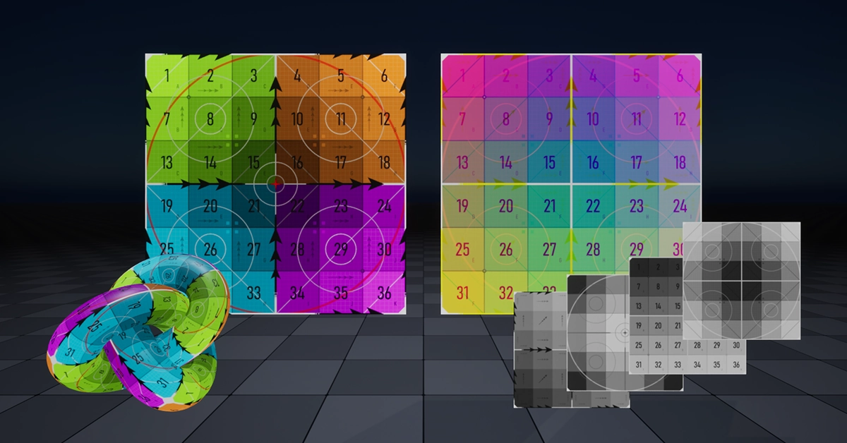
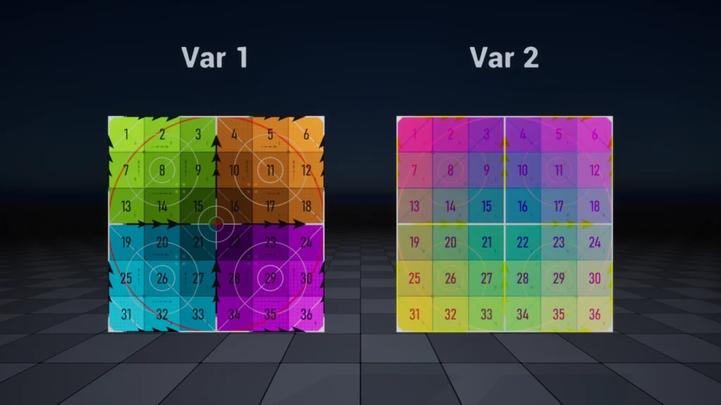
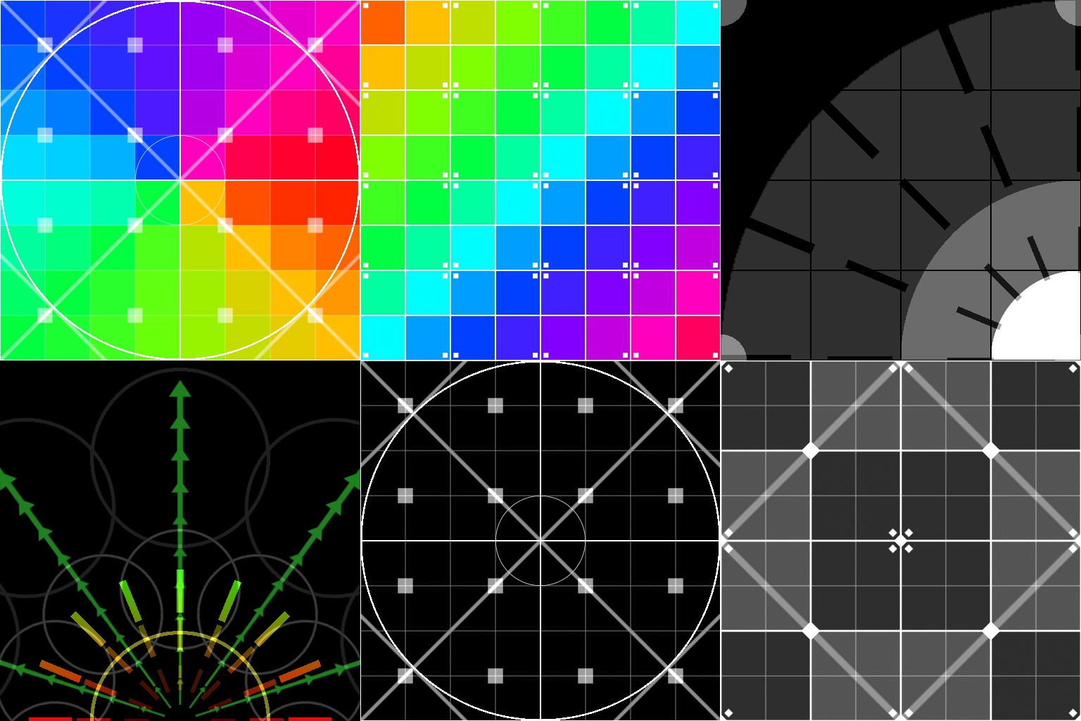
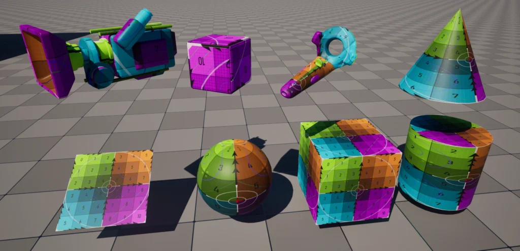
I created two different variants; the first one features a diverse range of elements and utilises a visually appealing colour palette. The second one is a packed texture, with a different layer for each colour channel. The elements are separated based on the purpose and use case of their corresponding layer.
Check out the Artwork Post for more media about the texture use cases!
Download
This is most likely what you came here for!
You can find various formats and resolutions. I’ve included the original SVG files as well in case you want to edit them to your liking.
It’s worth mentioning that at the time of this post, I haven’t used the texture extensively just yet. It’s possible that I’ll revisit the design in the future based on my personal experience.
Exploration
Why?
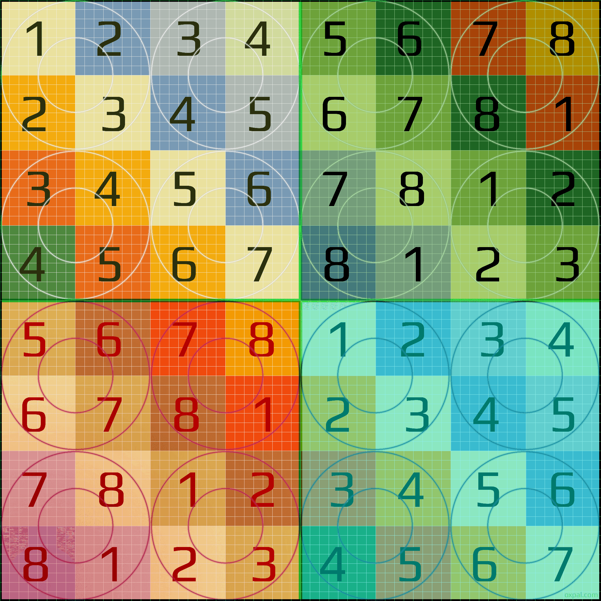
Up until now, I’ve been using the following checkerboard debug texture whenever I needed to debug something on the materials.
The creator is EliasWick, included there are a lot of different tiling options and pretty colour palettes.
It was created to check Texel Density, but I found it useful in a lot of generic cases.
You can find them here
I felt like it was a little bit bare bones, and I wanted to see if anyone had made other versions.
I stumbled on Oxpal‘s website and found some interesting ones.
Like Elias’, they were specifically to check for UV distortion on 3d models. I liked the addition of a finer grid and the circle to better identify the distortion.
Get the full res here
The research continued, and I found a thread about a collection of debug textures on the Realtime VFX forum by Chris.
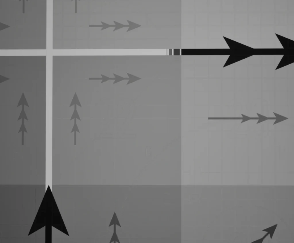
I loved the design of these; they looked a bit different from just a plain checkerboard, and targeted more specific needs, such as debugging a direction or orientation.
The thread
I thought that, because I found myself often using the same texture for debugging, even when working on widely different things, it would be nice to have a more generic texture that could be used for multiple purposes, a “one fits all” option.
Design
First Steps
Before starting the design, I tried to outline the things I wanted to include in it, and referred to it during its development.
Because the main objective was to make a multi-purpose texture, I knew that for it to fit multiple purposes, it would need to contain a lot of elements; this is why clarity was a major aspect I needed to consider. Maintaining a balance between readability and the amount of information.
I was hoping that I could achieve this by feeding my graphic design knowledge, being conscious of the way I overlay the elements, using the right opacities and sizes.
The lists of elements I wanted to include were:
- 4 quadrants
- Colours
- Medium frequency grid
- High-frequency grid
- Circles shapes
- Text, letters or numbers
- Diagonal lines
- Arrows
- Triangle shapes at the corners
Here, I think I did a likely bit of a mistake. I was excited to get started, but with hindsight, instead of listing what I wanted to have in the design, I should have defined what debugging purpose I was targeting. Making sure each element listed fell under one of the targeted categories.
I should have done it first, but I did do it at a later stage, when I started working on a second variant of the texture, one that contained different layers, one for each colour channel.
Vector Graphics and Illustrator
I love doing vector graphics, and this little project was the perfect opportunity to have some fun with Illustrator!
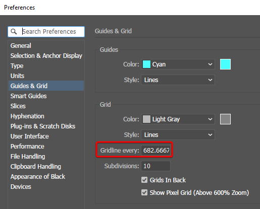
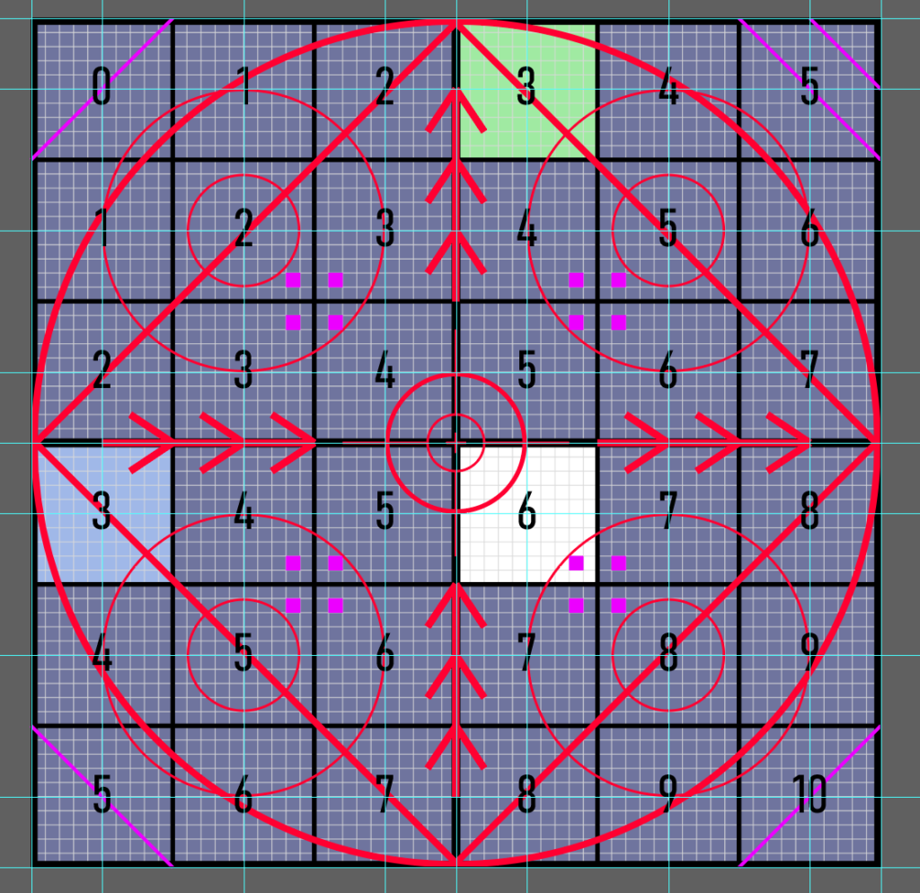
I was able to leverage its grid system to better align all the elements more easily. I decided to land on using a 6×6 grid. I tried a 4×4, but it didn’t allow for enough detail, then I tried an 8×8, but it was too busy. The 6×6 felt just right.
I’ve set up the project in pixel units as a 4k texture. When doing a 4×4 or 8×8, it’s easy to subdivide the 4096 pixels, but 4096/6 = 682.6 with 6 being a repeating decimal. However, in the preferences, I was able to edit the Grid, custom setting to that number, and have everything within the document snap easily.
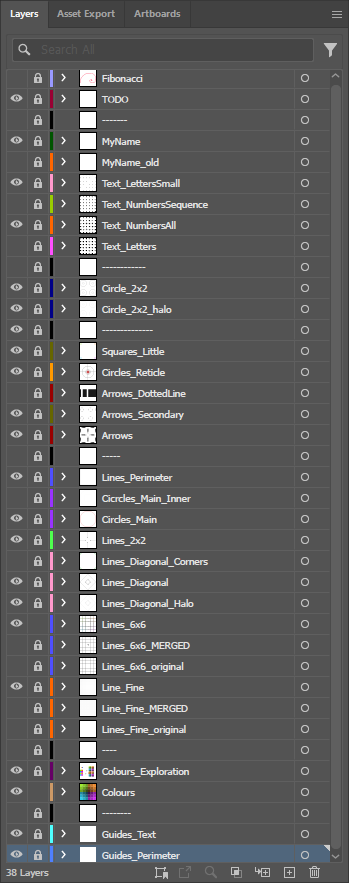
I’ve used the levels feature extensively to split the various elements and easily focus on specific parts of the setup.
Because it’s vector graphics, at the end of the project, I was able to export an SVG file, and from it, any resolution and file type I wanted. Even though in the end I’ve only included 4k PNG versions.
I’ve also included the SVG in the downloadable files, so that if you want, you can edit it to your liking.
Layers and Elements
As I have hinted earlier, each layer has a distinct debug purpose, and when doing the second variant, I’ve associated each element with its respective layer.
Below, I’m going over each element a little bit in more detail:
- All Layers → elements contained and useful for all layers
- Grid low frequency → made out the perimeter and the central lines, splits up the texture into 4 quadrants
- Grid medium frequency → the 6×6 subdivision, also useful to space out elements of the other layers
- Colours
- Quadrants → one colour for each quadrant, to more easily spot where the UV shell you are debugging is generally located
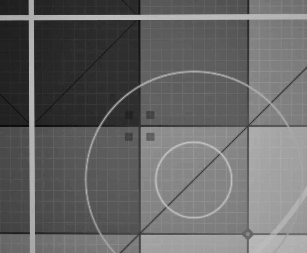
- Shades → can be used in different ways, for the main one, I’ve made the squares darker the closer to the centre, but I’ve then customised them for each layer. The distortion layer remained the same, in the flipbook, the squares get brighter the higher the number, for the direction they get brighter following the arrows, while for the pivot option I’ve applied a one minus operation, making the squares brighter at the centre.
- Triangular shapes at the corners → I added these so that the tiling points are clearer to identify
- Distortion → the most common type of debug textures are for checking the UV distortion of a model
- Grid high frequency → each 6×6 square is subdivided again 10 times, making a really dense grid useful to check distortion
- Circles of different sizes → better shape than squares to spot distortion
- Diagonal lines → also useful for distortion checks
- Flipbook → usually done using sequential numbers
- Numbers → sequentially from top left to bottom right, one number for each 6×6 square
- Letters → I decided to include the letters as well; they are slightly useful for the distortion, but also if you need to debug the flipbook of a distinctive row or column. They start from A in the top right and expand with the sequential letters in both directions, reaching K in the bottom left
- Direction → to check the orientation or the scrolling direction of a texture
- Arrows → both pointing up and right. I was debating if the up ones should actually be point down, to make it more intuitive when scrolling a texture, but this is the correct orientation when using Niagara particles set as velocity aligned
- Pivot → to check both custom rotations and scales
- Reticle → generally useful to spot the centre of the texture, especially useful when working with custom scales and rotation
- Circles of different sizes → included in the distortion, but useful here for the same reason as the reticle
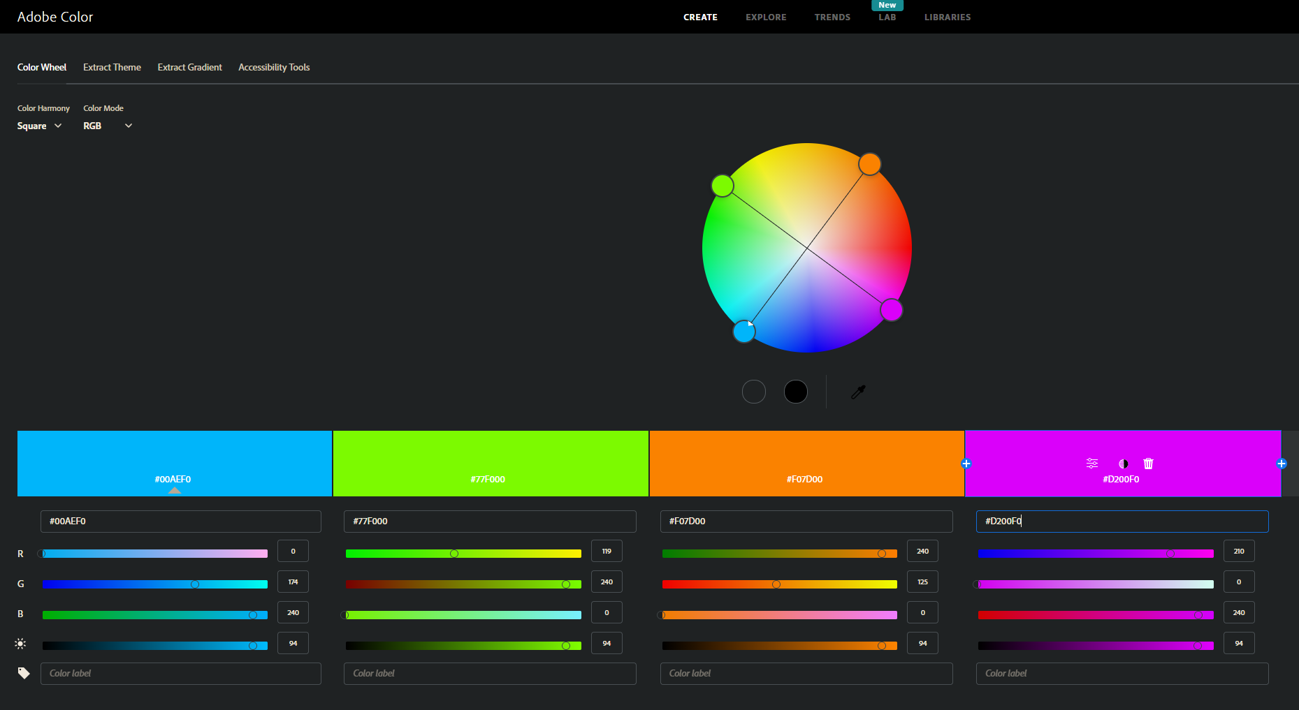
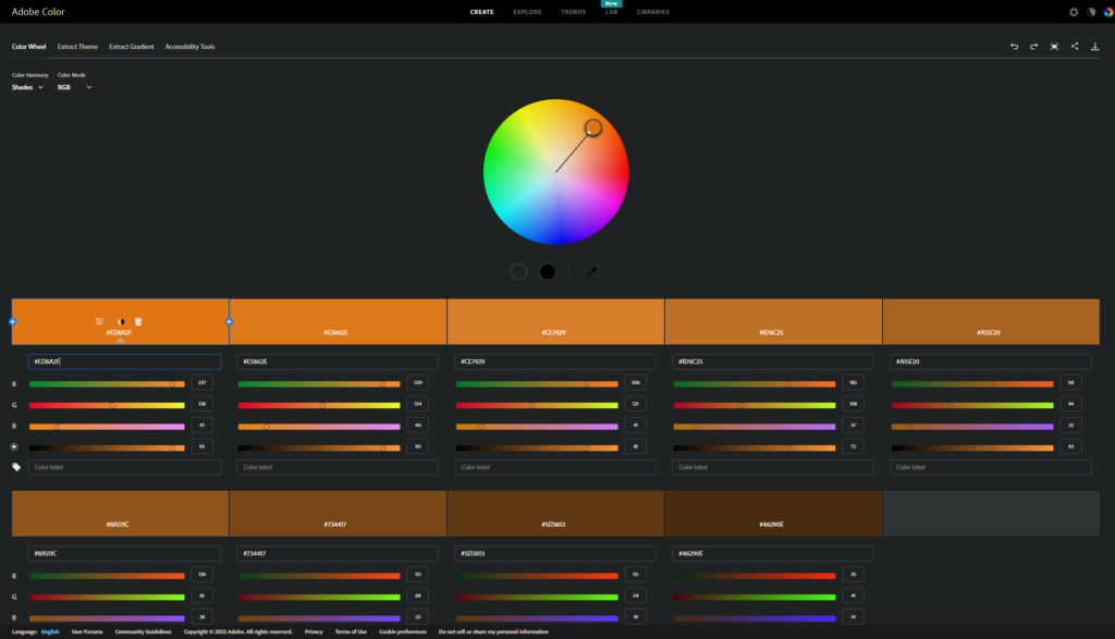
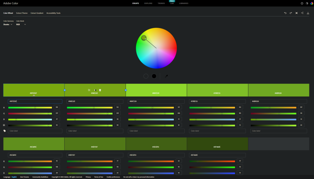
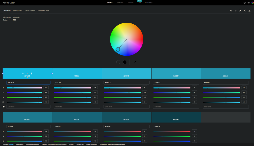
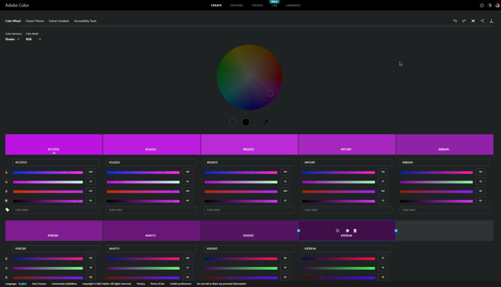
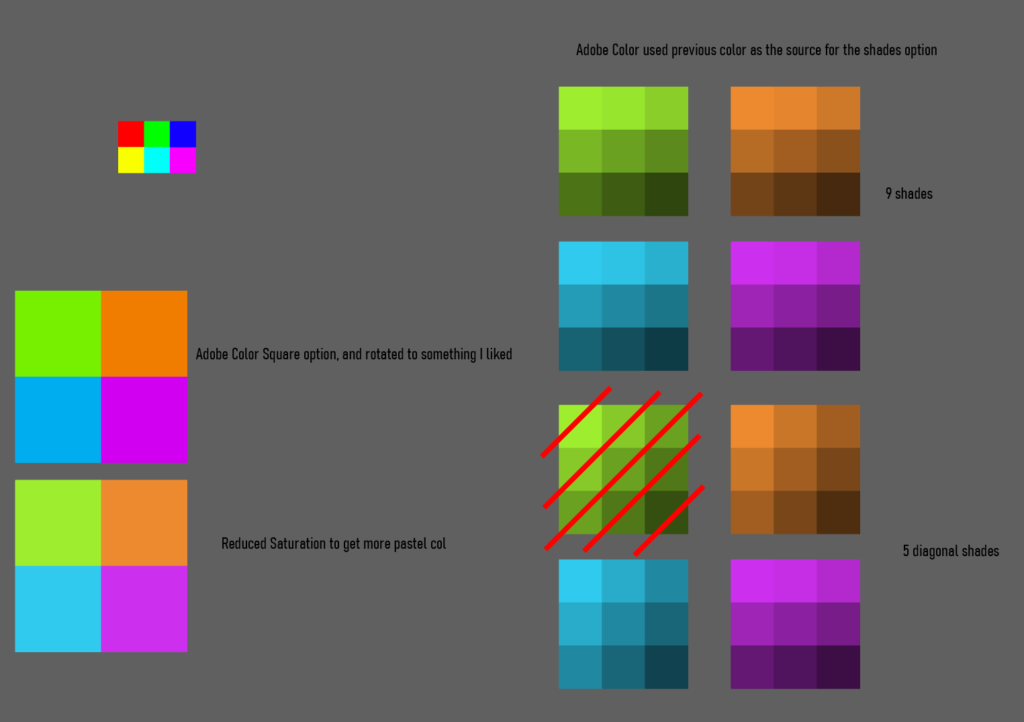
To decide what colours to use, I’ve used Adobe Color website.
The main colours have been selected using a “Square” colour harmony configuration, so that all colours are equally spaced from each other in their hue values.
I’ve then used the “Shades” configuration to easily find colours equally spaced in their brightness.
Variant 2
I initially wasn’t planning on making a second variant; however, once I finished the first one, it felt natural to have another version where each RGBA layer contained only the elements for a distinct purpose.
I also thought it wouldn’t have been much work since I had all the elements ready. Well, it turned out not to be the case. Yes, I had the elements, but to make each layer more useful for what they are meant for, they all required some additional work. Brightness values had to be adjusted, but the elements included also required custom edits and additions.
Initially, I tried to do everything in Illustrator, desaturating all the elements in a separate file. However, I struggled a lot with controlling how each element is overlaid on the others. I found out about blend modes, which I didn’t remember being a feature the software provided. However, they weren’t giving me what I was looking for.
Then, I tried to split the element into separate files. I had one with the elements that needed to be included in all layers (such as the grids), and one other file for each layer. The plan was to then do some blending compositing in Designer. However, that wasn’t the best solution since the vector graphics elements were layered on top of each other in a very specific order, to accommodate the design I was looking for and to keep things less busy and readable.
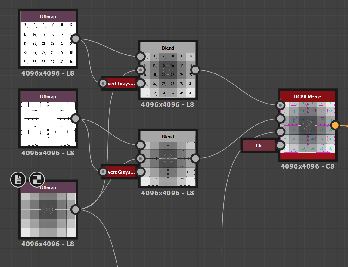
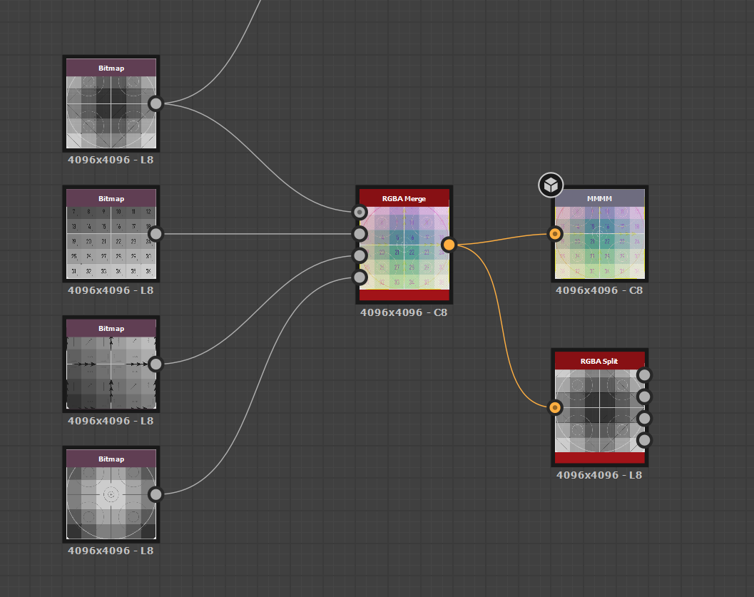
So, instead, I ended up just having a separate file for each layer, all of them grayscale. Then I used a designer just for the final packing, plugging each layer into its respective RGBA slot.
This approach of having them independent allowed me to also completely customise each layer, making them more useful for their specific purpose. It also allows for easier future edits if only one channel needs to be adjusted. Although it does break a little bit of the procedural nature, since if I need to edit an element that is contained in all of them, I would have to do it multiple times.
I noticed some bleeding in both the Red and Blue channels when using the Default texture compression in Unreal.
This is caused by how DXT compresses the texture; the Green channel is the one that preserves the most quality. This is also the reason why, in packed textures, we use that channel for the Roughness; it’s usually the one that requires the most quality, compared to Occlusion and Metallic.
The bleeding values are generally not a big problem in common textures, but because this one has so many specific graphical elements, the compression is more evident/apparent.
If you want to fix this issue, you can use either the Vector Displacement or the User Interface setting (this does increase the texture’s memory footprint, but being a debug texture anyway, it shouldn’t be included in anything that gets shipped).
I mentioned at the start of the post that the first variant contains a pretty palette, but I have to say that the packed variant, with all the channels combined, turned out quite pretty as well!
Exports
Because I haven’t used SVG in a long time, I wasn’t really sure what settings I should have used. If you are interested in exporting SVG files from Illustrator, I recommend this video; it’s a few years old now, but the contents are still relevant.
After that, I looked into exporting the PNG file, because I’ve set the artboard to be 4k. Illustrator was already exporting a 4096×4096 PNG image. However, I couldn’t really find a way to customise that size at export time, so I tried to resize it to 2k using Photoshop. Here, I found that the file size of the 2k version was bigger than the 4k one. This is due to how PNG compression works. I’ve mentioned something in the blog post I wrote about this new website here. It’s the first time that I notice an image in lower resolution being larger in size than its original counterpart.

Something I had to decide as well before exporting the files was the naming I was going to be using for the files. I wanted something more unique and exciting than just “DebugTexture” I often ask AI to come up with something better, and I would say that’s the most usage I do of AI. I did find myself wasting too much time coming up with the perfect “naming convention”, using AI just to give me a list of bullet point options helped me streamline the process, and I started coming up with more interesting names.
So, I asked it to come up with options based on the “multipurpose” quality of the texture; Omni was one of its listed suggestions.
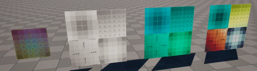
Development
Here’s a little collection of screenshots taken at various stages of the development of the texture:
Resoruces
- Debug Textures
- Compression
- Illustrator Export SVG settings overview → https://www.youtube.com/watch?v=6suNnASUnOc
Leave a Reply