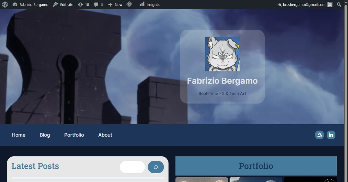
Welcome to my new Website!
I’ve always wanted to have my own website, now it’s the perfect time since I’ve been trying to get back into the habit of writing blog posts and sharing interesting things I stumble upon.
This will be the place I’ll share my work going forward. A combination of a Portfolio with my most recent work and a Blog to share knowledge about topics I encounter.
In this post, I’ll explain a little bit about the journey I went through in the creation of this website, from the initial research and findings to getting it ready for the public.
A little side note, I’ll be mentioning plenty of subscription services, everything I’ve written about them it’s just my personal opinion, I have not been sponsored by anyone.
ArtStation
In the past, I’ve been using ArtStation for both portfolio and blog, since at the time it was the easiest way to get started.
The portfolio aspect of it I praise, it’s an amazing place to share your art and be considered at a professional level, it’s what the website was made for and where it shines.
However, the blog feature has its advantages and disadvantages. The perks are that there isn’t really anything to set up, you can get started right away, and you get a lot of exposure, since it goes hand in hand with your portfolio, which in my case was already established.
The biggest downside is that to unlock the blog privileges, you need to pay a pricey yearly subscription (the pro upgrade). I have to mention that the blogging option is not the only thing you unlock with it; you do get additional bonuses, and I personally enjoyed the analytics feature. However, the blog was the main reason I went for the upgrade, because I thought making my own website would have been very complicated!
Personal Website
Options
The initial research was very overwhelming, mainly because there are just soo many options! I found it quite hard to understand exactly what I wanted and needed, and even when I figured that out, there were still a lot of alternatives to choose from.
The options available can be boiled down into 3 categories!
- Complete Package → I believe they are mostly known as Website builder services. In this category, you can find all the services that, out of the box, give you everything you need to have in a website. They host it on their servers, giving you a domain and usually some user-friendly and basic tools to customise it. Of course, with them, you can hit the ground running very quickly; however, what I don’t like is that they are usually quite pricey, and you are kind of locked in with them once selected. Meaning that if you want to stop using their services, it might be challenging to migrate your website’s contents somewhere else (I could be wrong tho, in a case-by-case situation). Examples can be: Squarespace, Wix, Canva, Webflow (this one, I think it’s a bit more advanced than the others), WordPress.com (the “.com” is important in this case, more about it mentioned in the next sub-section), and soooo many more!
- Hosting Service combined with WordPress Installation → spoiler, this is what I ended up using. You can get a Hosting service that keeps your website online, such as Hostinger, Siteground, Bluehost, etc. Then you can use a separate tool to design it. In my case, I’ve chosen WordPress, which is the most popular option.
- Custom Hosting combined with Custom website → This one is for the hardcore people. You can self-host your own website, deploying it using Railway, for example, which I’ve heard a lot of good things about, but I’m sure there are other alternatives to self-hosting. Then, if you want to take it a step further, you could fully design it from the ground up, with HTML and CSS. I studied graphic design in high school, and they taught us the basics of Dreamweaver. We had a few assignments where we had to design a website in Photoshop and then re-create it in Dreamweaver. It was extremely interesting learning the basics of how a web page is structured. However, that was when WordPress started getting popular; they then started teaching WordPress instead and, compared to self-coding, it was mind-blowing being able to quickly set up something professional with the use of a good template.
Of course, the last two options can be combined in different ways. For example, you could pay a hosting service and code your own custom website without the use of WordPress, or use Railway to self-host and make the design of the site using WordPress.
For the last two options, you also need a domain, which is usually included in the package when you go with an all-included website builder service. Hosting services usually do offer an option to get a domain directly with them as well; however, in a lot of cases, they offer the first year for free and start charging you for it after that. That said, if you are looking for a long-term solution, I found that it’s usually cheaper to get the domain from separate providers, as there are plenty.
Gotchas
Something important to be aware of: WordPress and WordPress.com are two different things.
WordPress is what I would define as a Website Builder Framework, a tool that helps you design a website extensively, but it ends there, as mentioned before, if you want to get it onlin,e you need a domain and a way to host it, which WordPress doesn’t provide because it’s not what it is meant for.
While WordPress.com is a Website Builder Service, a service that provides you with a domain and hosting, including a “washed-down” / “stripped-down” version of WordPress. Aimed to be simpler to use and user-friendly, but it heavily sacrifices customisability. And with it, in my opinion, you sacrifice a sense of “ownership” over your site as well.
It’s also worth mentioning that Hostinger, other than offering a hosting service, also provides a full package option, where you can design the site directly with them.
Personal Choice Breakdown
As I mentioned earlier, I decided to go with Hostinger as a Hosting Service, combined with a WordPress installation for the design, and buying a domain from Namecheap.
Once I finally decided what I wanted to go with, getting my website online, up and running was possible in a single day. Which I was extremely surprised by, probably because of all the worries I had before starting the process, about how it was going to be difficult to create it.
I do have to admit a couple of things: the website was online, yes, but it was empty, and it was using just a simple template. Also, the research was very daunting, because of the myriad of options available (which technically is a good thing since you should be able to get exactly what you need, but still, too many). This is one of the main reasons I decided to make this post; hopefully, I can make someone’s life easier.
Domain
For the domain, I went with Namecheap.
There isn’t any specific reason I went with them over alternatives, other than the price they offered me for the domain I wanted.
It was a bit cheaper than others, and they offered a 10-year option, which I think is among the longest ones you can get. I knew I wanted something for the long run.
I am not looking forward to renewing it in 10 years. I hope they don’t bump the price too much.
They also offer a hosting service for WordPress called EasyWP; however, o decided to keep the hosting separate. At the time of taking the decision, I think Hostinger was providing a more competitive price, and overall felt like a better option for what I was looking for. However, it might be worth considering if you’re setting up a website for yourself!
Hosting
For the hosting service, I decided to go with Hostinger!
They offer 4 different plans. I’m not going to explain all of them in detail, but you can find more about them below and here.
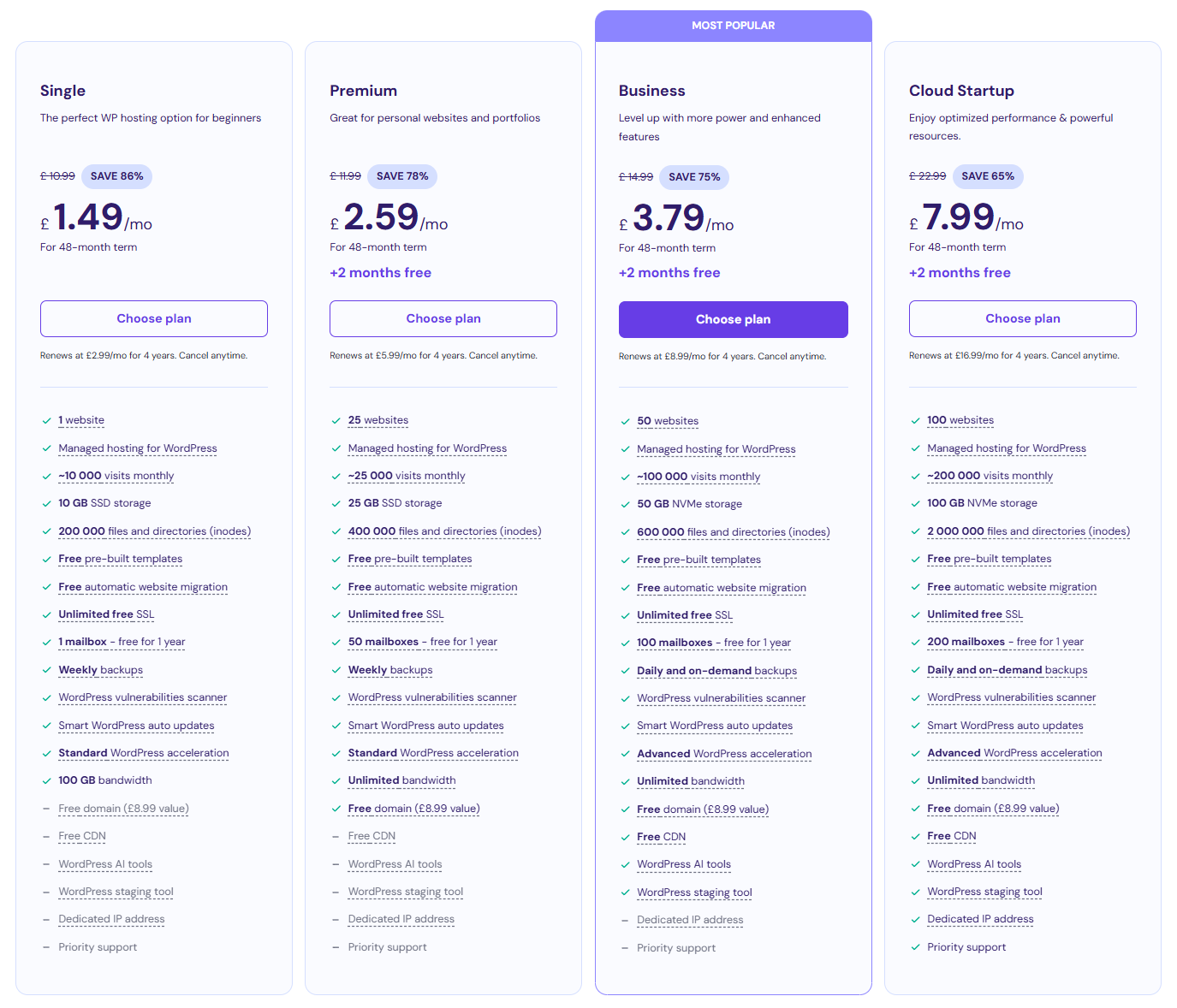
I personally decided to go with the Single option. With it, you can only host 1 website, which is all I needed, has a 100GB bandwidth limit, which I think is good enough and offers 10 GB of storage for uploaded media, which I was actually hoping for more. At the moment of writing, this costs £71.52 for 4 years, but when I got it, I paid £77.24, so it got cheaper already?
The Single plan option did not include a domain, which in my case worked to my advantage because I wanted to take it from somewhere else. If you are looking for an option with the domain included, you would have to pick the Premium option, which is £124.32, which is considerably more than the Single one; however, it does come with unlimited bandwidth and 25 GB of storage, over the 10 GB I got. Regarding the domain, tho, it is provided, yes, but it’s only free for the first year. After that, they charge annually for it, and they did not specify exactly how much it would cost; this is one of the reasons I preferred to go with an alternative.
Hopefully, I’ll have enough storage space and won’t have to upgrade anytime soon. To prevent this, I’ve tried to be very conscious of what I upload.
Ultimately, I went with Hostinger not only because it was offering a good price for what I wanted, but also because it looked like the most intuitive to set up. I did a quick tutorial research beforehand and noticed there are a lot of resources online on how to get started with a WordPress installation when using Hostinger.
Design
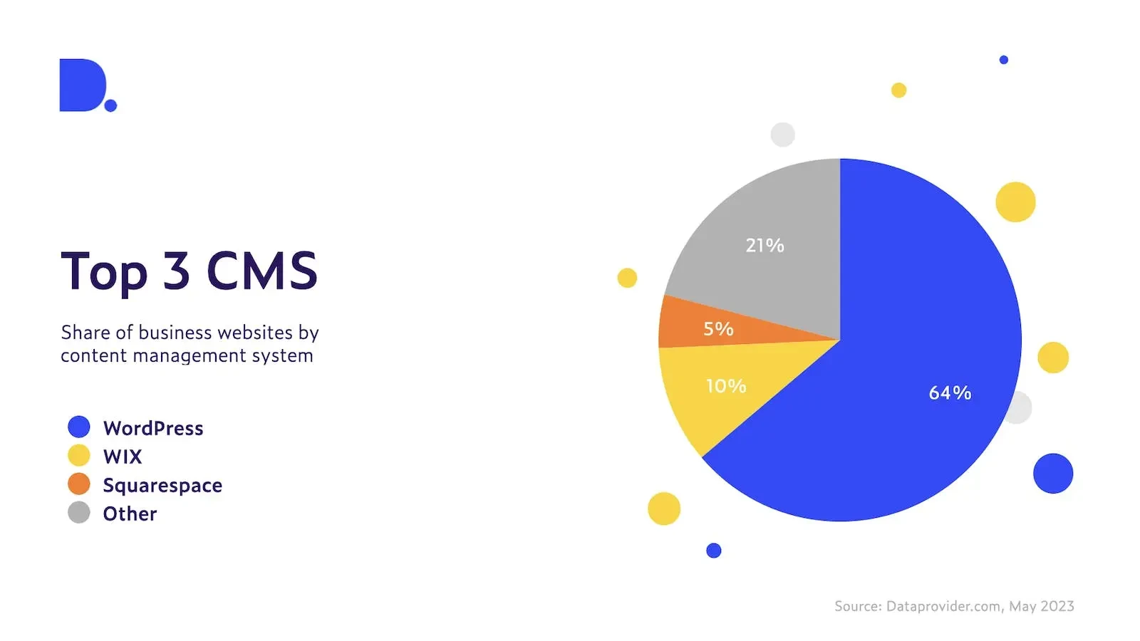
For the design, I chose to use WordPress, it’s the most popular and dominant CMS (Content Management System) currently available, it’s free and open-source, there are plenty of learning resources online, as well as established plugins. These are the reasons I chose it.
WordPress
WordPress deserves its own section in this post because that’s where I’ve spent the majority of my time in this process.
Installation Setup
To get started, it was very easy. I only had to hook up my domain with Hostinger, by changing the DNS on Namecheap, get Hostinger to install WordPress, and the website was up and running using one of the default templates!
Design
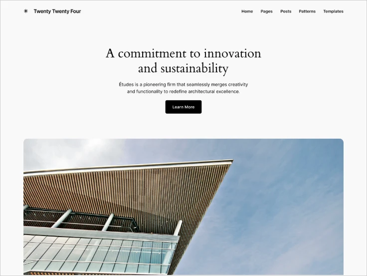
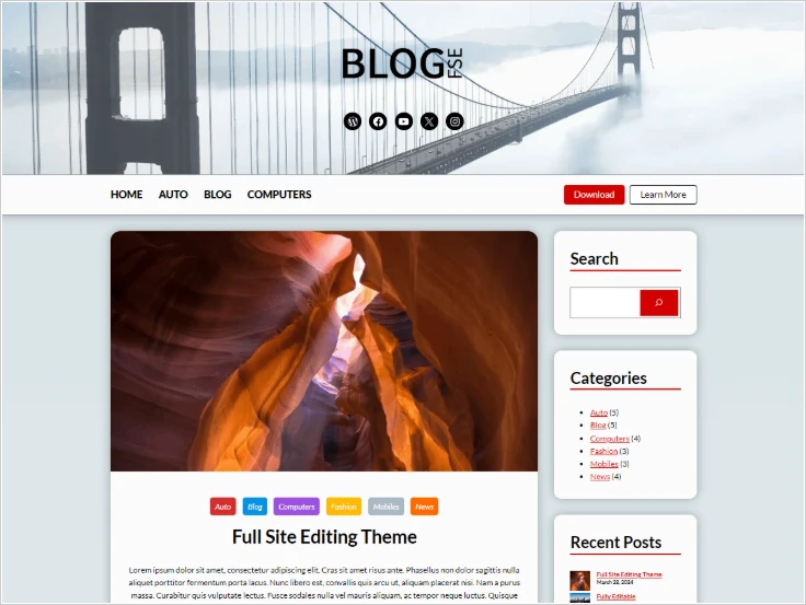
When getting started designing a WordPress website, you can get something decent-looking by using a template. You could spend hours browsing through them and end up finding exactly what you were looking for, or deciding to go with the most vanilla theme, so that it would be easier to customise at your pleasure. In my case, I initially found a theme I liked called Blog FSE, but then I ended up deciding to go with the WordPress default theme, yearly release Twenty Twenty-Four, hoping it would be easier to get it to look exactly the way I wanted.
Browsing theme options it’s definitely a good way to get inspired. However, most of my inspiration came from looking at the websites of other Tech and FX artists in the industry. Here are a few examples of some:
- Simon Schreibt → https://simonschreibt.de/
- Thomas Harle → https://www.tharlevfx.com/
- Niels Dewitte → https://nielsdewitte.be/
- Emil Dziewanowski → https://emildziewanowski.com/
- Sondre Utheim → https://sondreutheim.com/
I initially started the design process by working on the main page to get accustomed to the UI and tools, then moved to the “About” page, and because I’ve learned a lot during the process, I ended up going back to the homepage after that, improving the way things were set up.
It’s not that bad to get going and get something done quickly, but the moment you start being neat pecky, you can really sink hours and hours into doing little things (yes, this was my case).
That’s why sometimes I found the design process a little bit limiting, it allows you to get 90% of what you are trying to achieve, but when you want to do something specific, you have to start looking into free plugins, if you are lucky, or even have to dive more into CSS yourself. A lot of the fancy features you see online, I wish they were easier to set up, things like having an animation when hovering on an image link, for example. However, there are a ton of plugins available, and I hope that in the far future, I’ll be able to easily dive more into CSS and add custom logic to completely personalise exactly what I want.
More realistically tho, the reality is that because of the amount of time I spent on doing the design, I’ll probably want to keep it as is for a while, I’ll then probably forget about most of what I’ve learned so far, I’ll tell myself it’s already good enough, and I will never edit anything in the future. :)))
Of course, I’m not an expert at all, I guess a lot comes with experimenting and experience. I’m really happy with what I managed to set up so far.
Editor Overview
Most of the designing is done under the Editor option, in the Appearance section.
Here are some useful sections:
- Navigation
- Styles
- Pages
- Templates
- Patterns
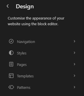
Below, I’ll go over some of the most important basics that I wish I knew before starting.
Navigation
The navigation is where you can see and reorder the main pages of the website, which are created in the “Pages” section.
You’ll also find the homepage here, which every website already has by default.
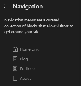
Re-ordering is useful because when you create a new navigation block, it will refer to these pages in the order you define.
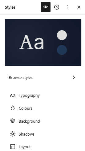
Styles
Here you can set the Font and Palette of colours that are used across the entire website.
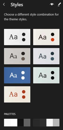
I might be wrong, but I think the styles you have available are defined by the theme you’ve installed; however, you can fully edit them. I would recommend selecting one you like and then customising it as you prefer.
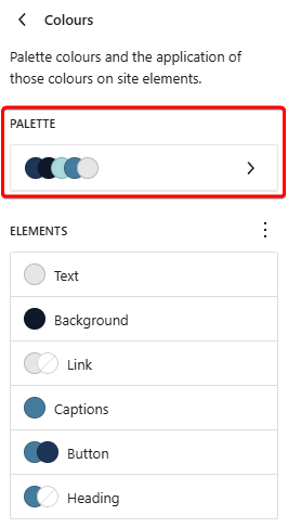
I’ve personally only edited the colours, but there are a lot of interesting exposed options.
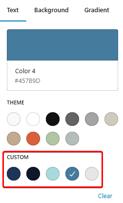
For the colours, just make sure you edit the palette first, then every time you change the colour of something, use one of the shown Custom options. This is because it creates a direct reference to the palette, and if you tweak it, you’ll automatically update all the elements that are using that colour across the entire website.
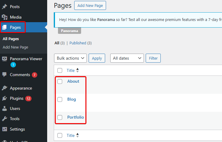
Pages
The pages section allows you to view, edit and add pages, which can also be added from the main Pages section on WordPress
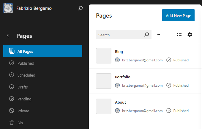
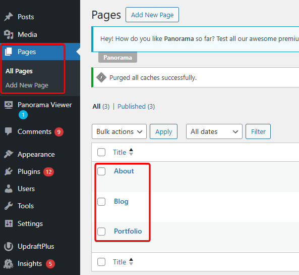
In the case of my website, I only have 3 (since the Homepage exists by default):
- Blog
- Portfolio
- About
These are the main pages of the website; you might want to have a custom design for each of them, with only the Header and Footer as a common content block.
In this section, you can also draft and schedule new pages, which is something I don’t need since for most of the content in my website, I decided to heavily rely on the blog posts and the category archives features. This helped me manage and organise the bulk of my content, and allowed me to have things more automated for both portfolio pieces and generic posts, more about it later. However, this might not be what you are looking for, and instead, you want to have multiple pages for your content.
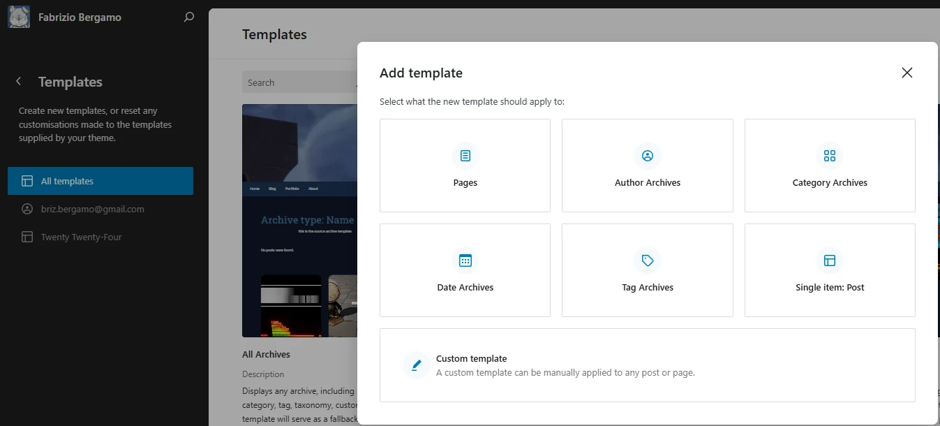
Templates
Here you can manage templates, an easier way to apply the same design to multiple pages.
Patterns
In this section, you can manage Patterns and Template Parts, which include your Header and Footer as well. They are blocks that help you design each page of the website with cohesion.
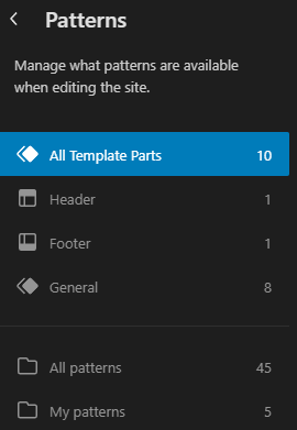
It took me a little while to wrap my head around the difference between Patterns and Template Parts; your chosen theme probably comes with and makes use of pre-built ones. Which you can always edit, duplicate or make new custom ones.
They can both be referred to as “Blocks”.
Below you can find some information about both of them that I’ve gathered online from various sources.
Template Part
- The main components of a website, such as the header and footer
- They are synced across pages, and if edited, all instances update
- Can only be used to design a template, not in a content area (inside a post)
- Cannot be exported or imported
- Don’t transfer when switching themes
- Nesting is not recommended; it shouldn’t be used inside a pattern
Patterns
- Used to be called “Reusable Blocks”
- Can be both Synced or Unsynced
- Can be used anywhere, even in a content context
- Can be imported and exported as JSON files
- They transfer when switching themes
- Multiple patterns can be nested
Usage Examples
- Template Parts → blocks repeated side-wide, like header and footer
- Synced Patterns → for content that needs to be updated across the entire site but is not part of a template, like promotional messages
- Un-synced Patterns → for elements that require unique content on each instance, but should share the same layout
Initially, I only started using the Header and Footer functionality, since they were already set up out of the box, but only at a later stage did I learned how useful general Template Parts and Patterns can be.
They are extremely powerful if you have a very complex website. In the end, I didn’t use the theme extensively since my website doesn’t require many unique setups. If you are finding yourself copying and pasting structures between pages and templates, then you should start considering using them; they help out in the long run.
Responsiveness
It’s worth being aware of this concept if it’s the first time you make a website.
A site needs to display properly on a lot of different screen sizes. As a general rule of thumb, when you are setting the dimensions of a main content block, just make sure you don’t use raw pixel values, but instead work with percentages. There are plenty of resources online on the topic.
During my designing process, I tried to test my pages at a couple of different resolutions, mainly on a 2k, 1080p and phone screens. This allowed me to be more conscious of some of the design decisions. It’s far from perfect, but at least it should be good enough to be able to read through all the content I post, which is the main thing that matters.
The Pain
Migrating my ArtStation content to the website was the most painful and time-consuming process that went into creating the website. This is for a couple of main reasons:
- One place for everything
Even though I am not planning, and probably will never delete the content I’ve currently published on ArtStation anytime soon, I prefer having everything in one place. This is why I decided to copy all my content to this new website. I personally really like being able to see the progression and journey I had in the industry, even by including things I’m not particularly happy about anymore. However, especially for a portfolio, I understand the importance of “don’t show anything that is not your best work”. This is why, in my case, it was important to rely on a solid filtering system that allows me to have both worlds, keeping everything, but also being able to cherry-pick what is shown and where. Having a portfolio category that only includes what I consider to be the most relevant content first as “default”, and making the older content visible only if the user searches for it.
2. Media Organisation
When starting something new, it’s also an opportunity to try and set up things the “right” way. Organisation is something I consider should be done right; this includes media file names and size footprints.
For the naming, in the past I’ve already been trying to append numbers to easily sort the media alphabetically based on the order they should be presented in the post. On top of that, I also decided to append the initials of which main category they belong to, Aw### for Artworks and Bp### for Blogposts (more about this in the Structure section), as well as another chronological number for the release order of the post. As an example, the very first media file contained in the first blog post posted would be named: Bp001_01_<filename>.<extension>, while the 7th media file of the 3rd artwork posted would be: Aw003_07_<filename>.<extension>. (37 👀)
For the file sizes, because I am paying for a limited amount of hosted space, for future-proof reasons, I wanted to manage it smartly, keeping the media size to a minimum, while also trying to avoid compromising its quality. The opposite of what I was doing on ArtStation, where I wanted to upload the highest possible resolution allowed. For videos, I decided to offload the website’s storage completely by uploading all of them on YouTube, with maybe just some small exceptions for very short clip videos, the kind of videos that could be a GIF (decent quality GIFs have such a big file footprint, I would avoid them altogether).
Here is also worth noting that I found out you can publish blog posts “in the past” by editing the time and date of what gets published, even if it actually got online on a later date. This way, I could copy the original times I posted my content on ArtStation and have the option to have a chronological timeline of it all.
Images Compression
PNG and JPG
This is a little bit of a side note regarding file sizes and the format of uploaded media.
Regarding images, I got myself a little bit distracted exploring the differences in compression between JPEG and PNG formats. It’s widely known that JPEG uses a lossy compression, resulting in a poorer quality image, but with the advantage of reducing its file size. PNG uses a more lossless compression, which is more useful when you are looking to preserve the quality of an image, but it comes with the cost of larger file sizes.
I thought this was a ground truth, and it is true, but it is partially because when we are talking about images, we are generally referring to photos or pictures. I noticed that when taking a screenshot of a software that contains mainly UI elements, if you save the image in both formats, you might notice that their file size is similar or, even more weirdly, the PNG version is way smaller.
I discovered that PNG performs so much better with more “illustration-style” images. If the image has a large area of solid colour or gradients, the file size will be a lot smaller than its JPEG counterpart.
This is because PNG does a per-line pixel prediction and, if possible, it’s able to reduce to a colour palette of 256 colours, greatly reducing file sizes!
While JPEG divides the images into grids of 8×8 pixels, and for each grid it tries to quantise separately the low and high frequency values, this works perfectly for compressing a picture.
Applying it to an example, the screenshot below was taken from Unreal Material Graph:
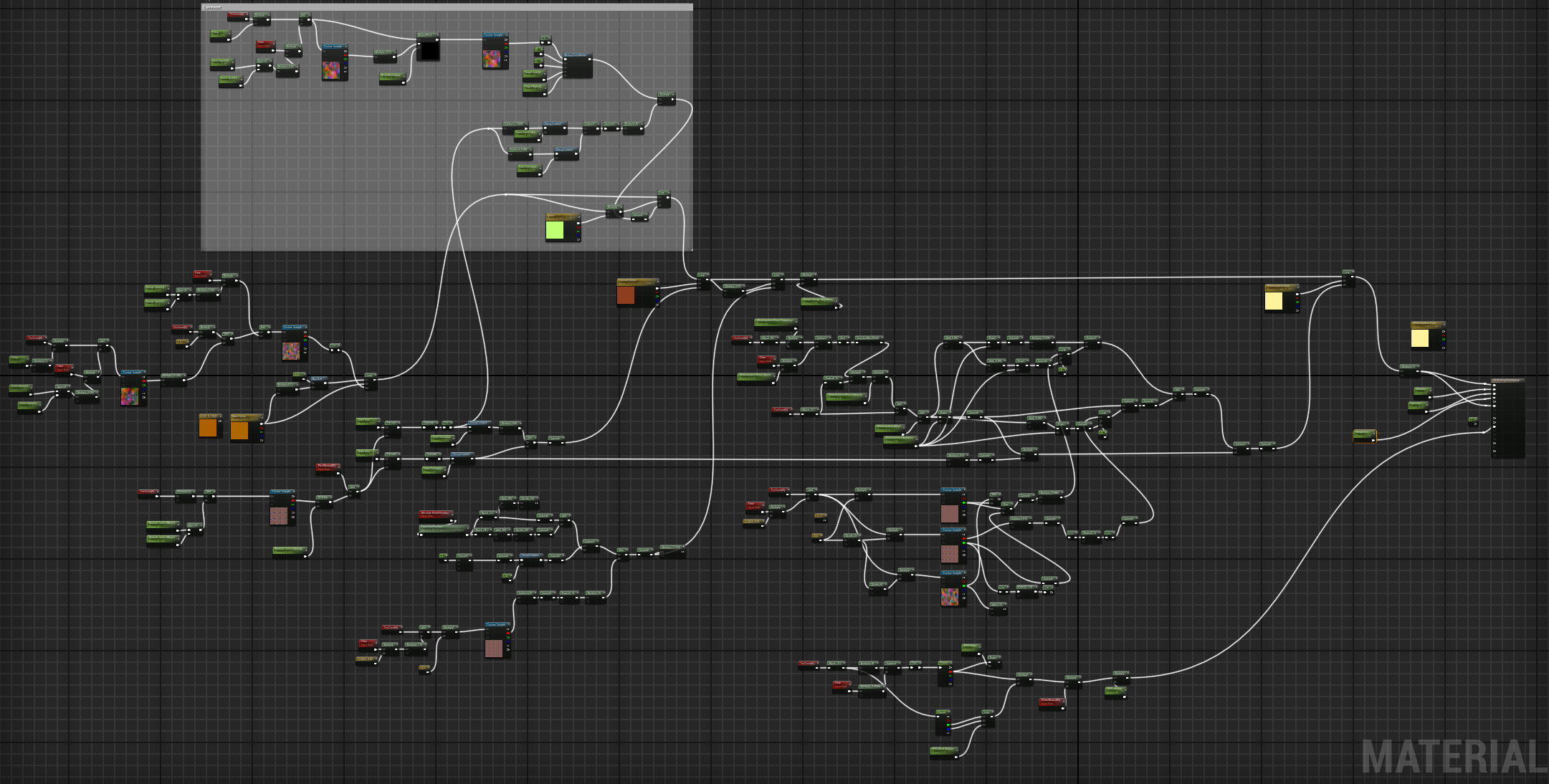
Because there are a lot of nodes to display and because I’m working on a 2k monitor, the resolution of the screenshot is large. Moreover, software’s UI are predominantly filled with text and large areas of solid colours (viewports are probably the only exception), like in the case of the screenshot shown. These are the perfect conditions for a PNG to thrive when it comes to quality and reduced file size.
Here’s the comparison between the two file formats; you can see that the PNG is half the size:

However, the smaller the image’s dimension, the less difference there will be in file size between the two formats!
Here’s a comparison with the image set at 480p in height:

This was just a surface-level description of how the two formats compress an image. If you are interested, you can find so much more information online!
WEBP
I also found out more about WEBP!
It’s a format made by Google and released around 2010, it was aimed to be more compressible while maintaining the quality of a JPG. What’s great is that it supports both Lossless and Lossy file types, which is the reason you would use PNG over JPG that I explained earlier!
It used to have a lot of hate because browsers started adopting it way before image viewer software did, and nothing was really supporting it. It created a lot of frustration in the users when they stumbled on an image of this file type when trying to download something from the web. Because it was pretty much unusable if the aim of the download was to use it inside another software. To get around the issue, the user was forced to take a screenshot of the image opened in a browser, not ideal.
However, it’s now universally supported, and an image can be easily saved as a WEBP using Photoshop, and even Windows can preview them!
Here’s the comparison of the image shown before, in the 3 formats:

It’s half the size of the PNG, and I can’t find any difference in quality between the two! Extremely web-friendly!
There is also WEBM, which supports videos; you can use ffmpeg to convert to it.
There is only one video in this post, a short clip of 7 seconds, the webm version is almost half the size:

Just looking at this example, it seems like the conversion is worth doing.
I didn’t use it for the media I’ve uploaded on the website so far, because I discovered more about it only at a later stage. However, all the images in this post are WEBP! And I’m considering adopting it for the future!
Structure
My idea was to split the website into 2 chunks, very similar to ArtStation’s setup, where you have a section of the Portfolio pieces and one for the Blog.
The Blog section was straightforward to structure, I could just “make posts”. Blogging runs through WordPress’ veins! It was originally born as a tool to publish blogs, so there are a lot of built-in features that accommodate the creation of them. The main ones worth mentioning are related to “sorting”; you can create Parent and Child Categories, as well as add tags and a thumbnail/cover image for each post.
However, the Portfolio section almost got me opening a huge can of worms that I’m glad I haven’t touched. Initially, I was thinking of making custom pages for each entry, but I quickly realised that I was not going to be able to filter them nicely with off-the-box solutions, like you can with blog posts. I started looking into ways to categorise my content, and I stumbled upon a plugin called Category Ajax Filter and then the more impressive Advanced Custom Fields. I did a surface-level research of it and quickly realised it was way more advanced than what I needed, at the time I was already overwhelmed by WordPress’ features alone. I was afraid to invest time learning and to rely on an external plugin for the core structure of the website, which would have probably required future upkeep when new versions are released.
Reached this point, I tried to take a step back and realised that the already built-in blog post features provided by WordPress were already everything I was looking for. I decided to leverage them for both Blog Posts and Portfolio Pieces, by creating 2 Master Categories and letting them have their own child categories.
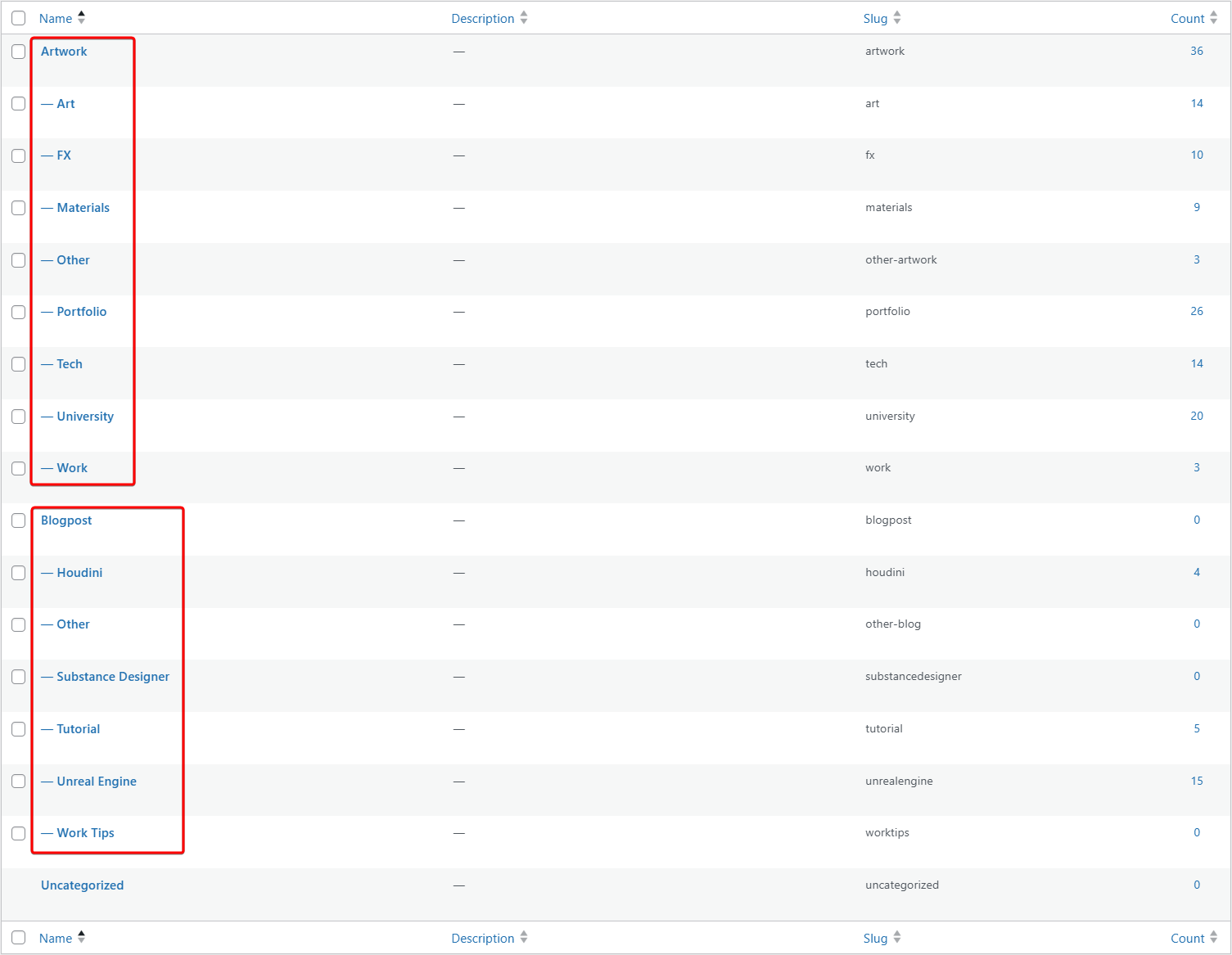
This way, for WordPress, “Everything is a Post” and gets treated equally in the backend. The Master Category defines how the content is split, allowing to have the content to be presented in 2 distinct navigation pages, as well as having 2 different templates for the posts.
This works perfectly because each category that gets created has its own website URL (e.g. https://fabriziobergamo.com/category/blogpost/unrealengine/), and the navigation pages can direct you to those pages, which in turn contain a targeted filtered list of the posts.
Below you can see a graph of the Website’s page structure.
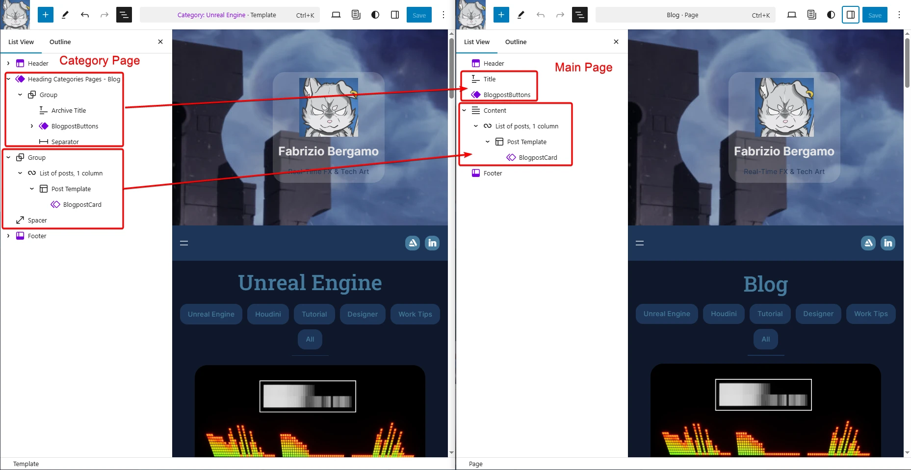
There are 4 Main pages. The Blog and Portfolio pages contain a list with thumbnails and titles of all the posts that fall in their Parent Category. In them, a Navigation Buttons Bar (made using a Template Part component) directs you to the pages of specific categories. Then each Category page can be set up using different Template Pages, and they can be configured using the same design across them. This gives the impression you are not loading a new page, but instead filtering the content visualised.
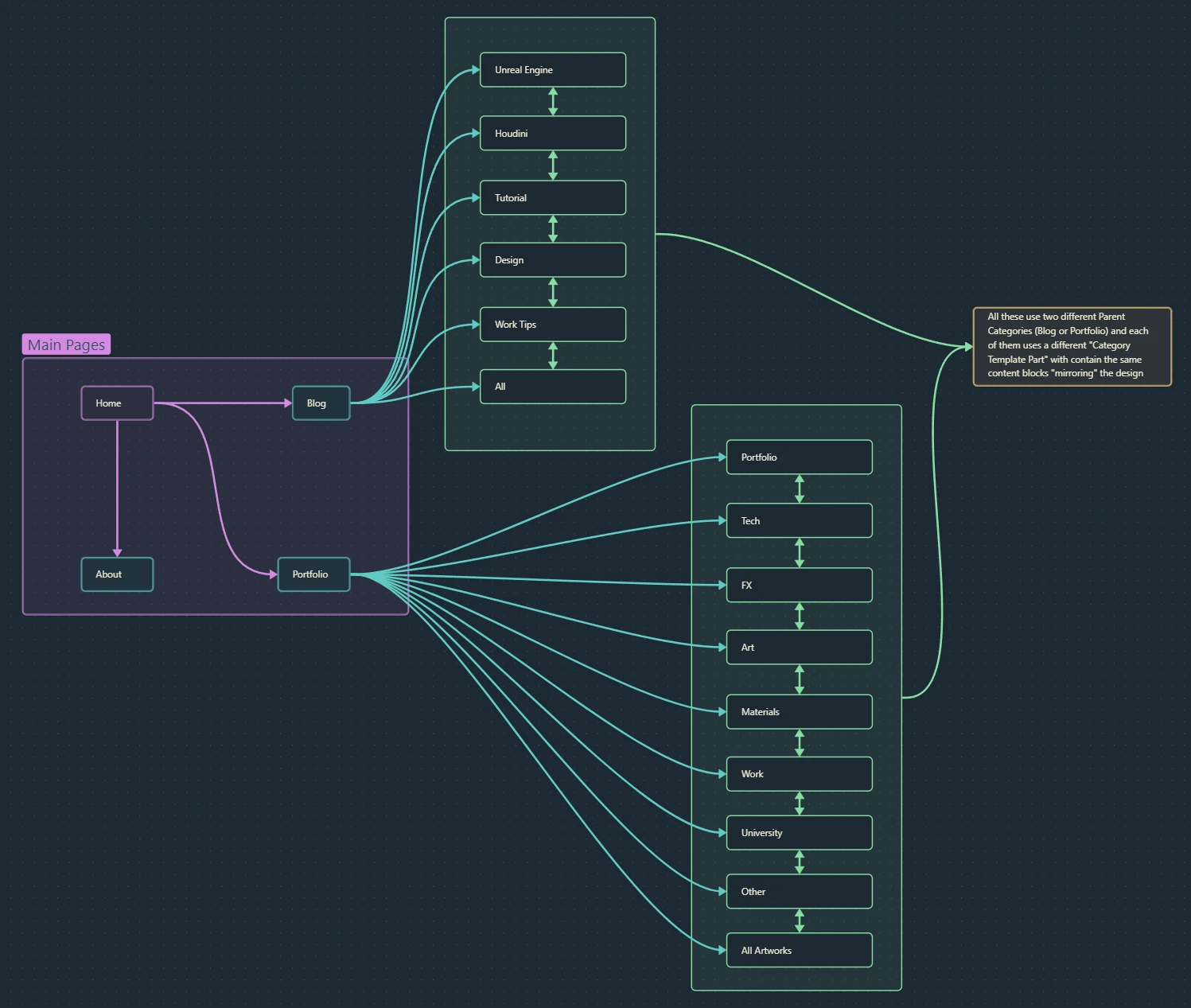
Main Pages
Homepage
The homepage is probably the page I’ve edited the most since it was the first one I was playing with when I started the designing process. I then made my way back to it at a later stage, when I had more knowledge about the tools, so that I could set it up better.
Of course, all the pages contain a Header and Footer set up as Template Parts; you can find a little breakdown of them in a later section.
The homepage, since it’s the most important one, I wanted to clearly show what the whole website is about, essentially splitting it in half, showcasing both the blog and portfolio nature of the site equally, and have it display the most recent content posted.
Both sections require some manual setup. I looked into trying to automate the content shown based on the posts published; however, I feel like I get a lot more control and value by manually adding the content here, and tailoring it ad-hoc to my liking. This means I need to manually update this page every time I post something new, but the benefits outweigh the downsides since it’s not that much work.
Here’s a little breakdown of the Posts section:
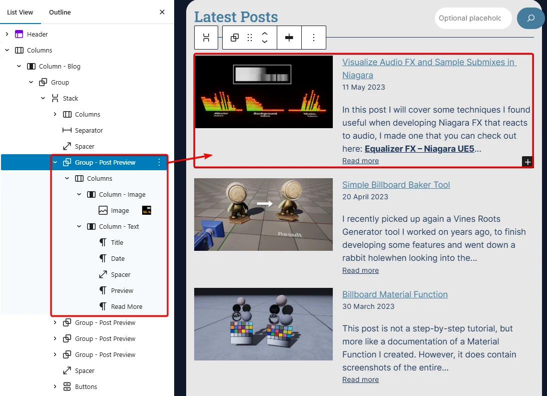
You can see in the outline how things are set up. The screenshot is showing one of the post’s previews: the text content is manually filled i,n and the thumbnail also holds a link to the target page. I was thinking of trying to use an Un-synced Pattern for this, but just duplicating the section multiple times was a quick and easy solution. The pattern might be worth considering in the future for easier edits.
The Portfolio part:
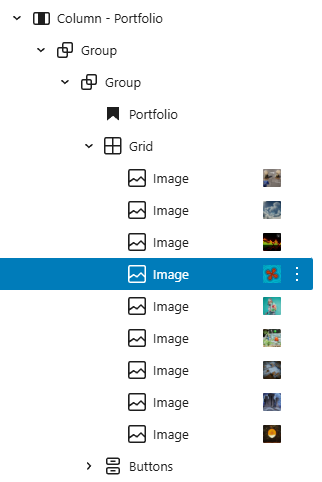
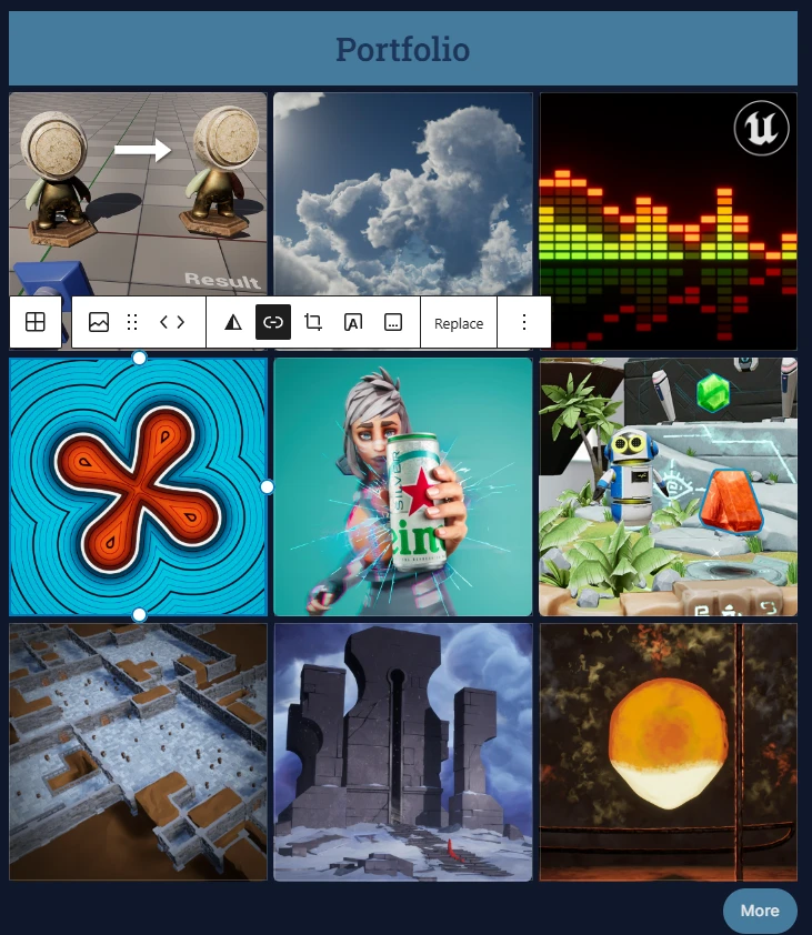
This one is a lot more straightforward; it’s just a grid with images, each of which holds a link that directs to the target page.
About
The most awkward page to write… I tried to keep it short, sweet, and to the point with contact information at the end. This was the second page I played around with, and I haven’t really updated it much after that. It was really good to get a better feel of the tools and what is possible.
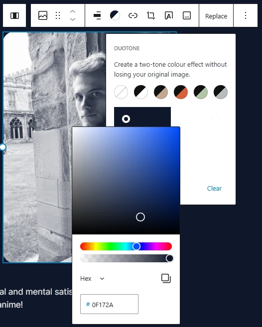
Worth mentioning the filter duotone option on the images, I applied one on the only image of the page, and it was good enough to give me what I was looking for, without having to do any processing in a DCC like Photoshop.
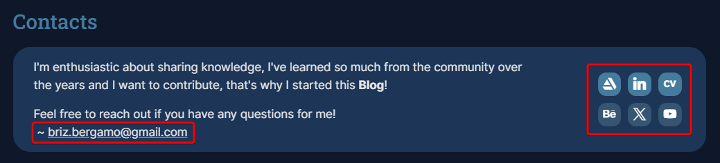
You probably haven’t guessed, but on this page, there are a couple of plugins in action: an Email Encoder for the email shown, and one for the Social Icons. More about both of them later.
Blog and Portfolio Navigation
These are the main navigation pages used to reach the content posted on the website.
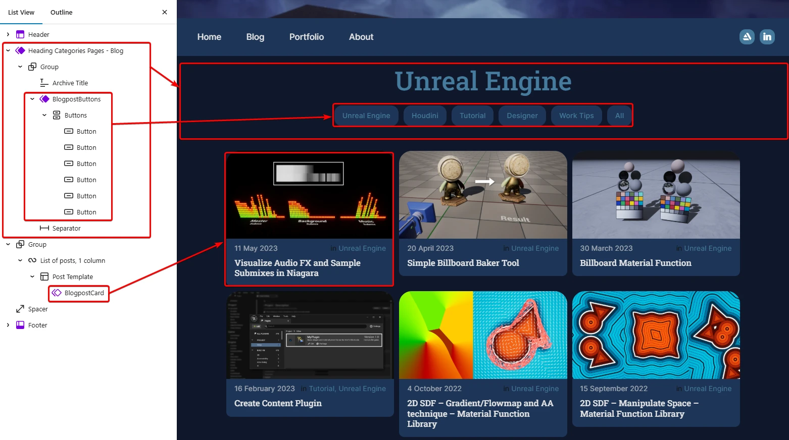
For both these pages, I’m leveraging a Template Part for the Filtering buttons and a Pattern for the Post Cards,
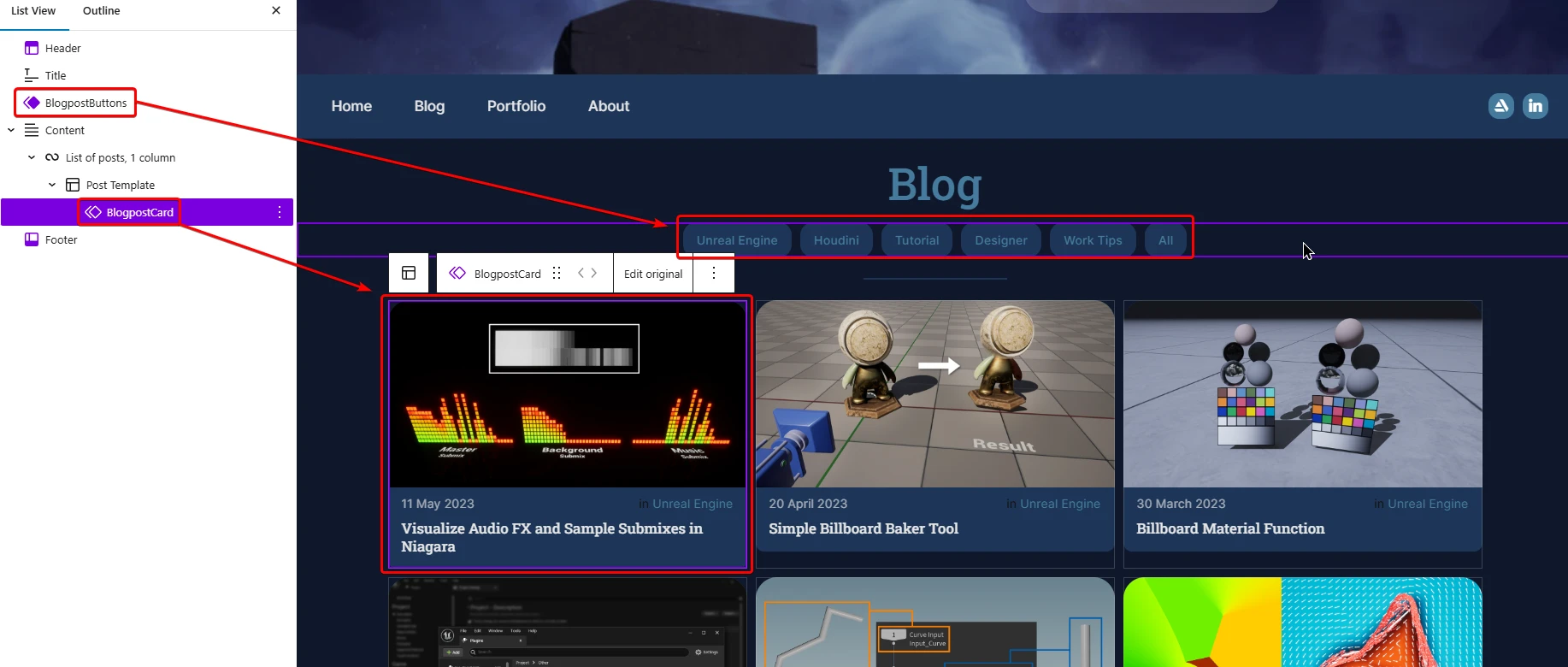
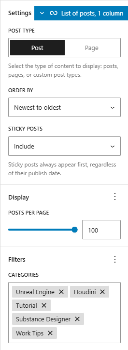
They also both have a List of Posts content Block, which provides some useful settings to filter the categories shown:
The way these main navigation pages work is by having the buttons link to the various category template pages.
For example, the URL of the blog posts page is: https://fabriziobergamo.com/blog/, and if the “Unreal Engine” button is pressed, a new page gets loaded with the following URL: https://fabriziobergamo.com/category/blogpost/unrealengine/
All the category pages use a theme, and they all contain the same block elements as the 2 main navigation pages, with the same settings. This way, when a button is pressed, it doesn’t look like a new page gets loaded, but instead, it appears like the page you are currently on remains the same, and the button is only acting as a filterer of the content visualised. Of course, to make this work, each category page has different filter settings under the List of Posts content block.
Templates
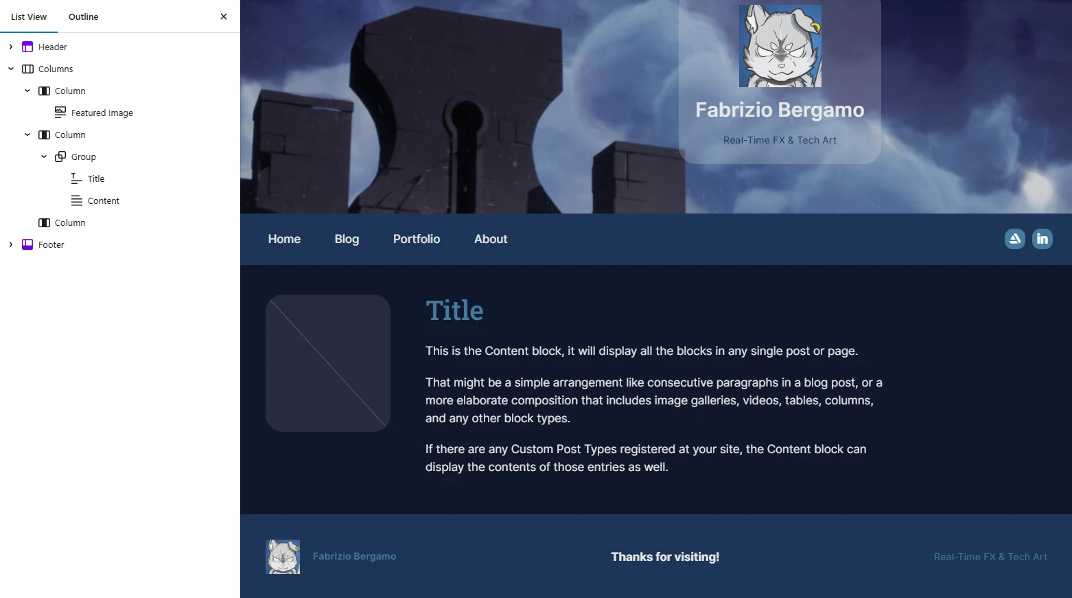
Head and Footer
This is probably the content that gets repeated the most across the website.
Below you can see their design and outline:
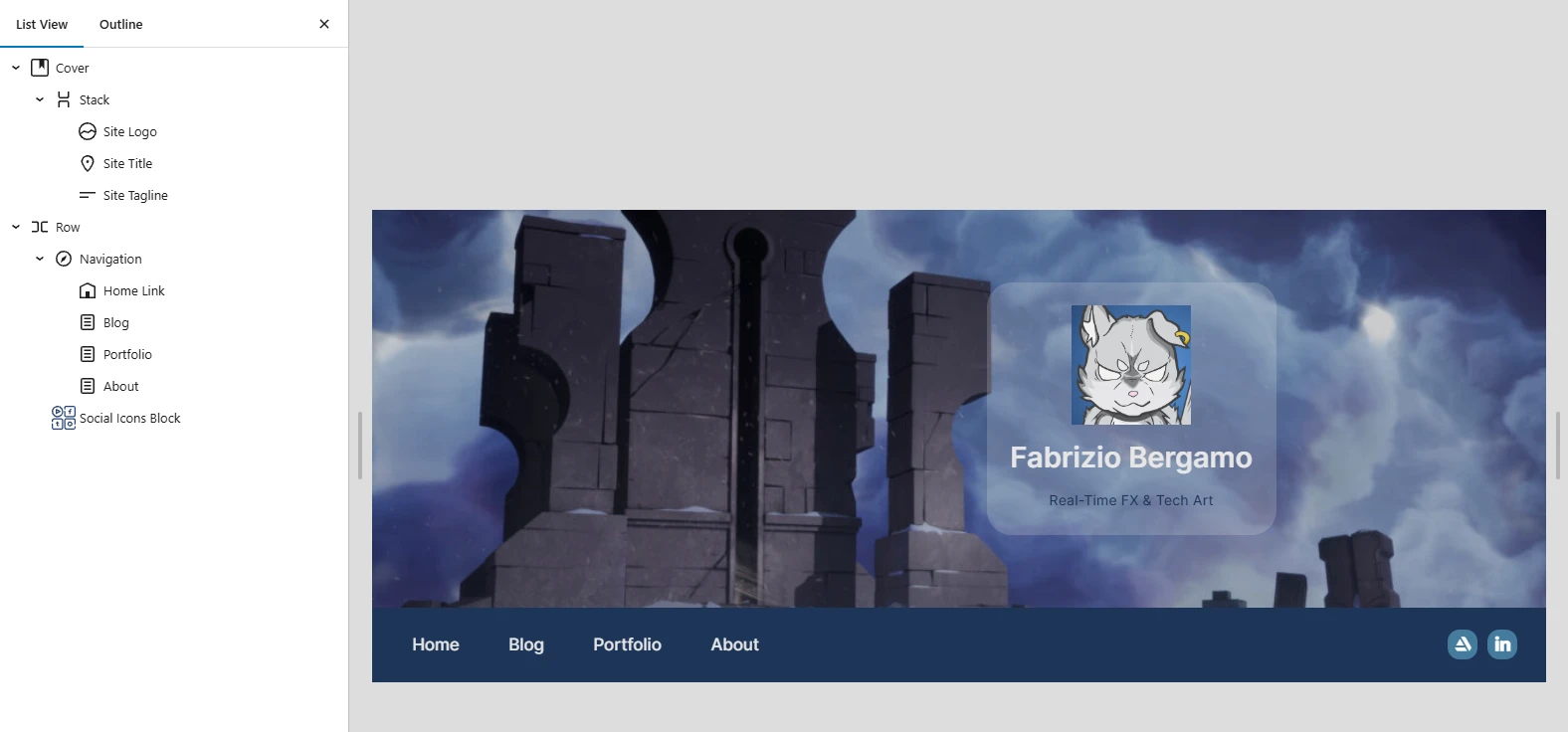
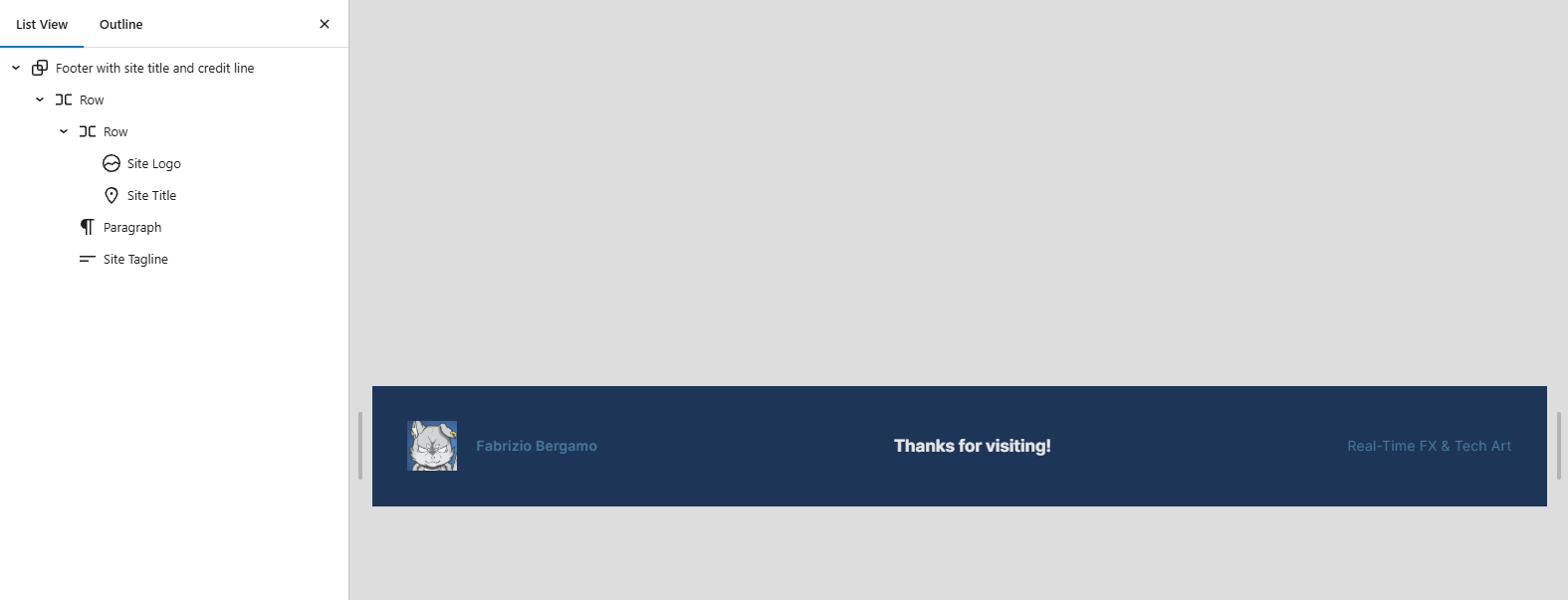
There’s nothing too fancy about them, other than using some provided Content Blocks that can be useful to update the same information across multiple places, such as the Site Logo and Title.
I’m also using the Social Icons plugin I mentioned earlier, and a Navigation Menu that links to the main pages of the website using the “Home Link” and “Page Link” content blocks.
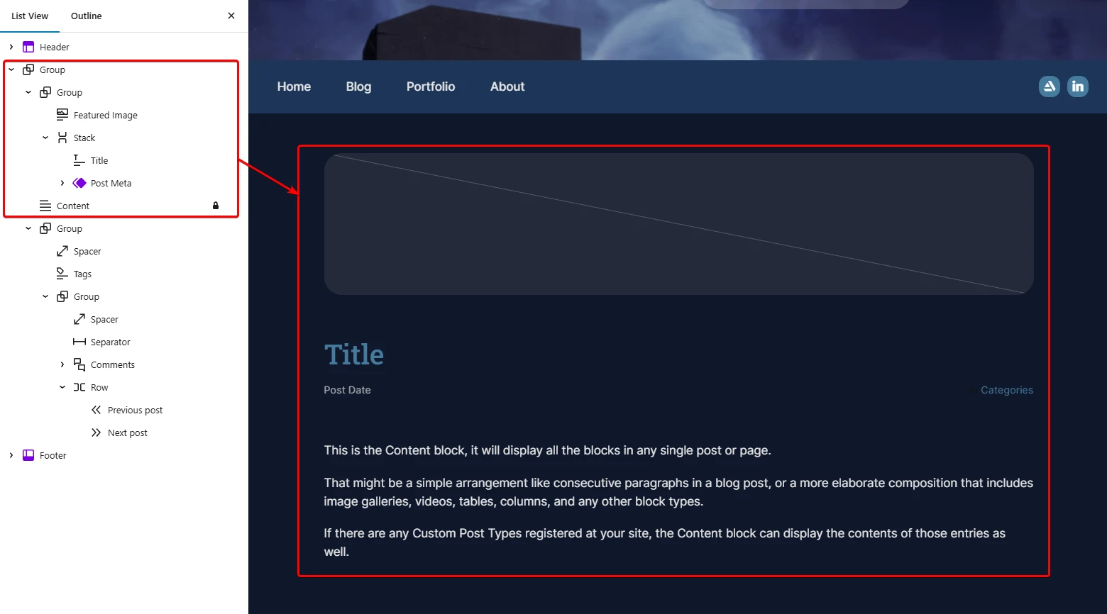
Artworks and Blogposts
These two templates are used when creating a new post based on the Parent Category they fall under.
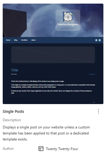
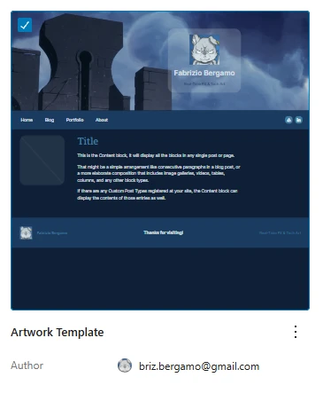
The Artwork template is quite straightforward; it’s just set up as columns, to have the thumbnail on the left and the content on the right.
I’m not planning on having much text in the Artwork posts; they mainly contain media.
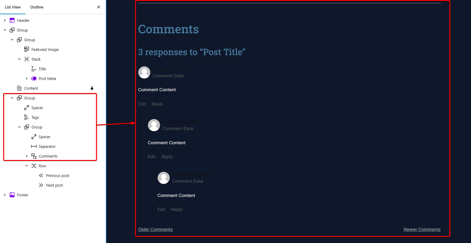
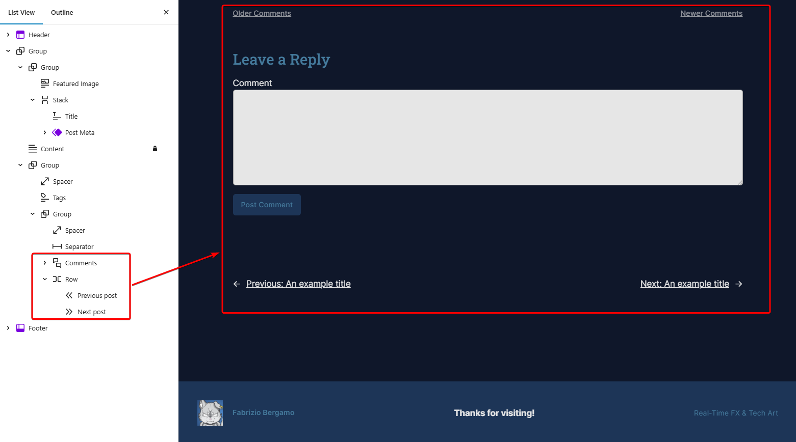
The Blogpost is a bit more complex, just because it contains a comment section box!
For this template, I edited an existing one included within the Twenty Twenty-Four theme.
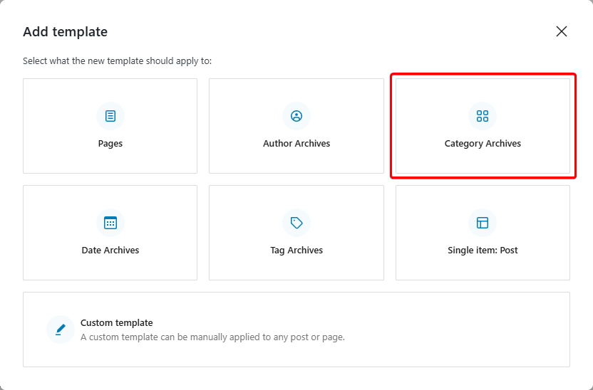
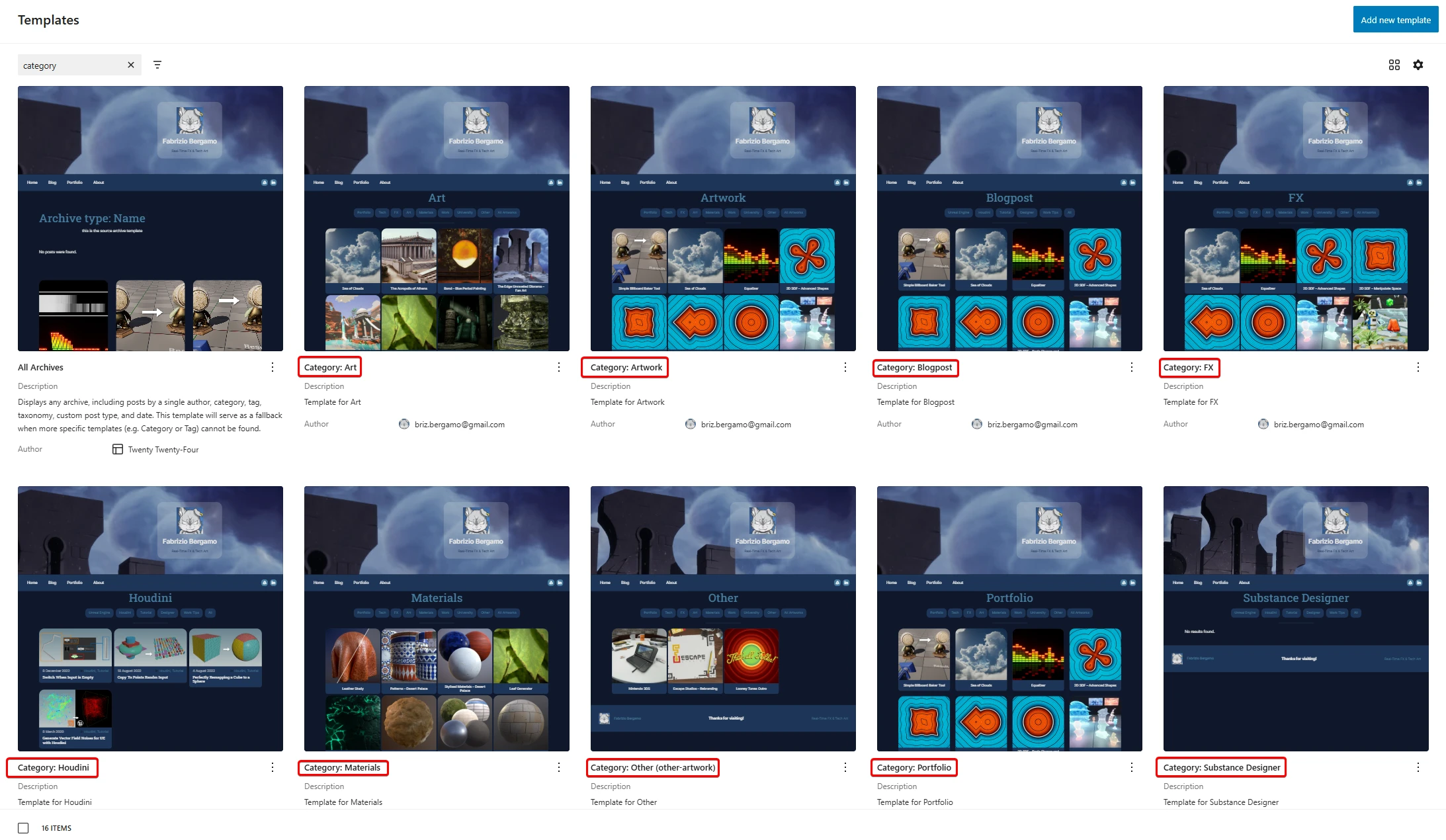
Template Pages – Categories
These two Template Pages are the ones I slightly addressed earlier in the Structure section. This was the last piece of the puzzle to finalise how the website is set up.
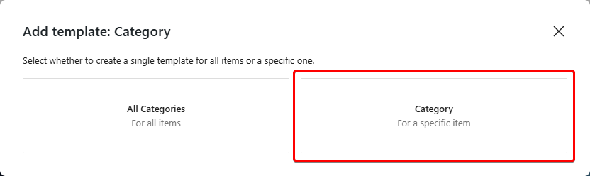
In the template section, I found out that when you add a new template, there is the option to create a template page for a Specific Category.
So I did that for each subcategory; I designed the look in one of them and manually duplicated it across the others.
I didn’t like the fact that I had to manually copy over the content across all the templates, so I used a couple of Template Parts and a Pattern to set up the look.
The only thing that had to be manually edited for each page is the List of posts’ Filter, otherwise I have:
- Heading Categories Pages → Which contains the Archive Title (the text gets automatically updated based on the current category).
- Buttons → This is also its own Template Part. I’ve added a button for the existing category.
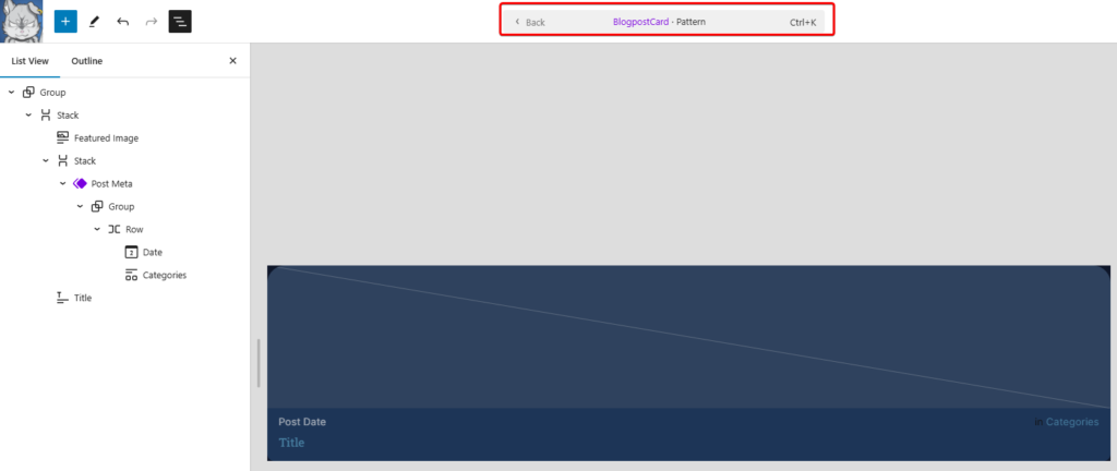
- Cards → It gets automatically used and populated by the List of Posts content block. It contains the Thumbnail of the post and its relative metadata.
For each of these elements, I have 2 versions, one for Blogposts and one for Artworks.
This works perfectly for the Category subpages, but then I have done the same for the 2 Main Blogpost and Portfolio pages. I’ve mirrored the design so that the entire navigation system is consistent.
Plugins
During the development process, I kept encountering things I couldn’t do within WordPress out of the box. That’s when I started looking for plugins that could achieve what I was looking for.
Below, I’ll quickly go over all of the ones I ended up using one by one.
Backup
UpdraftPlus – Backup/Restore
After I’d started designing the website and uploading more and more content, I started getting worried about losing all my work. I found this plugin, which allows me to back up the website and get it to automatically upload the files to my Google Drive. I haven’t tried to restore a backup just yet, but I can see all the zipped files on my Drive. You can also set up a schedule, so that it does it on its own.
Social Icons
Social Icons Widget & Block by WPZOOM
WordPress provides a Social Icons content block; however, it doesn’t have many customisation options for the look of the buttons, and within the provided website options, ArtStation wasn’t included. You could create custom buttons instead, but I couldn’t find a way to easily replace the text with an icon image.
This is why I ended up using this plugin; I found it quite intuitive and easy to set up with what I needed.
Email Encoder
Email Encoder – Protect Email Addresses and Phone Numbers
In my about page, I wanted to share my email so that anyone can reach out to me if they have any questions; however, I was afraid that it would be picked up by spam bots. This plugin was a simple solution for that; it just needs to be added and activated, and it does the rest!
Spam
WP Armour – Honeypot Anti Spam
I constantly receive spam comments in the comments sections of all my blog posts, so I looked into a way to automatically filter them. I found this plugin, which is suggested a lot. It’s early days, but I hope it has solved the problem.
Analytics
Google Analytics for WordPress by MonsterInsights
One feature I was getting obsessed with when I had ArtStation Pro was the Analytics page. I was fascinated by all the stats shown, and I was hoping I could get something similar for tracking my website visits.
It looks like I could get some interesting information by using Google Analytics, and I found the Monster Insights plugin, a good option to link to it and be able to see the information directly within WordPress. I haven’t played around with it much yet, especially because there isn’t much data to be looked at yet. For this, I’m also concerned that most of the better features are locked behind a paywall; only time can tell.
Table of Contents
Easy Table of Contents
This is a great plugin to easily get a Table of Contents section created and automatically populated with the headings of the current post. It does its own thing, and you can easily turn it off on specific posts if you wish to do so (very handy option for my artwork posts, since I don’t want it there).
360 Viewer
Panorama
I had a bunch of 360° images on some of my ArtStation Artworks, I was happy to just avoid migrating them here; however, I found this plugin that allows them to be properly visualised in a web page.
Others
I mentioned earlier in the Structure section that I found a couple of interesting plugins that could be used as the backbone of a website.
Below you can find a list of all the ones I found worth mentioning. I didn’t use them, but if you have the time and energy to invest in learning about them, they probably have a lot of features that could elevate a lot the quality of a website!
Feel free to dig your rabbit hole:
CSS
CSS coding is worth mentioning; if you are more of a developer, you’ll love the things you can do with its integration within WordPress. There is a lot of potential to be unlocked here!
You can easily add CSS code when editing any page in the Editor section:
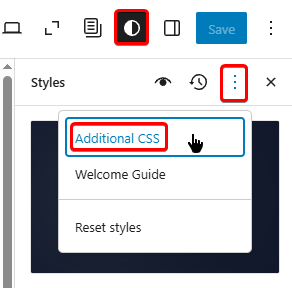
The only time I’ve used it was to hardcode the colour of the text comment box area field that is displayed at the bottom of a blog post:
.comment-form textarea,
#respond textarea,
.comment-respond textarea {
    background-color: #E6E6E6;
}
I don’t think it’s something I will pursue learning anytime soon, but it’s cool to know the possibility is there.
After rapping up with the website, I was curious to look into ways to get the website to appear at the top of Google searches when typing my name.
Turns out that there are companies that offer services to help out with that. I never thought about it, but it does make sense that there would be.
This process is called Search Engine Optimisation, SEO for short. I’ve done a quick research and it looks like on the surface level there are 3 main things to consider:
- Keywords → Find keywords that best describe your website, and sprinkle them everywhere across it.
- Website Quality → If it’s healthy and optimised, with fast load times and a secure browsing experience.
- Backlinks → When other websites link back to your one, the more they do, the higher the website will rank for search engines.
However, it looks like this is a whole rabbit of its own.
If I were searching for my name when I started working on the website, it was ranking around the top 5 entries. I have now noticed that when I’m logged in with my Google Account in Chrome, it ranks first; however, when searching from another device or if I’m logged out, it’s second.
For now, I will have to accept that my ArtStation profile is the first one to appear, hoping that maybe, with more content getting posted on this website, the order will switch!
Conclusion
I’ve always dreamt about having a website about my work, and I’m really happy now that I have one! It’s not perfect, but it mostly looks like the way I’ve envisioned it!
It has taken a lot of time, but just because I struggled working on it with consistency. When I started the research on the Domain and Hosting service, I was a little bit overwhelmed, but once I decided what I wanted, I had no trouble getting it online!
I feel like going with WordPress was the right choice. There are so many things you can do, I feel like I’ve only scratched the surface. Coming from a graphic design background, it was fun to discover how everything has evolved since I studied it. It’s a lot more intuitive nowadays. I enjoyed designing it. Now and then, I was even able to access it on my smartphone and do some simple, quick edits!
However, I do have to say migrating all my content was a bit excessive. If you are looking into doing something similar, I would suggest copying over only the most precious work you have. It’s a very useful thing to do to get familiar with the setups and understand better how you want the website to look. I have conflicting feelings about having done it. I do value having everything in one place and being able to see the progression of my work (even if most of it doesn’t get shared online), but it was extremely painful and time-consuming. I kept procrastinating working on it, and it’s time I could have spent working on other projects…
To recap, if we only consider the time I’ve invested:
- Initial setup and getting it online → Quick and easy
- Structuring and organising the content exactly the way I wanted → Time-consuming
- Migrating content and keeping naming convention → Extremely time-consuming
It would be nice to have a tool that automatically compresses in the most optimal way, and renames all the media that I upload to the website!
Sooo… Was it worth it?
I would say absolutely!
Although I don’t think I will stop using ArtStation, right now it doesn’t replace it completely. On ArtStation, you can get a lot more exposure, and that’s where most people find artists; it’s the industry standard. However, in the future, I will try to leverage it in a way that promotes the website. Trying not to spend too much time on the artworks posted there, but instead trying to gather someone’s interest and redirect them to the blog for more in-depth information about what I made. In conjunction with LinkedIn’s posts, I hope to direct more traffic towards it.
It took me a long time to figure out how to gather my thoughts and properly explain everything I wanted to cover about this journey. Mainly because, like I did with the website’s setup work, I’ve kept putting it off; however, it is an intricate setup! I hope you found it somewhat useful!
I’m sorry if this was a long read. Here are a couple of bonus kitten pictures as a reward:
Resources
Below you can find a bunch of resources you might find useful:
- Hosting Services
- Hostinger
- WordPress
- Dominance
- Origin Story
- Design
- SEO
- Images Compression
Leave a Reply